Kitchen Inspiration: The Marston House
/One of my favorite buildings in all of San Diego is The Marston House, a 1905 home historic home that’s oozing with original charm and innovative design. With kitchen planning on my mind, I’ve been taking in the unique features of the butler’s pantry and cooking space in the old house, so I wanna show you!
The house was built for George and Anna Marston in 1905 by Irving Gill. It’s designed in the Arts & Crafts style of architecture which was a departure from the Victorian style that was full of ornate detail and flourishes. In Arts & Crafts homes, simplicity and cleanliness was key. You’ll notice throughout this space that there are lots of clean lines and many elements that were designed for ease of use, practical cleaning, and sanitation.
I struggle sometimes with designing my new kitchen while balancing keeping it true to its 1915 origin while also wanting some modern aesthetics. What’s great about The Marston House’s kitchen is I think it demonstrates how some “modern” design elements are rooted in historic construction.
So, keep an eye out for “modern” aesthetics in a 114-year-old space as well as creative utilitarian and cleanliness tricks that surprisingly didn’t make their way to 21st century design.
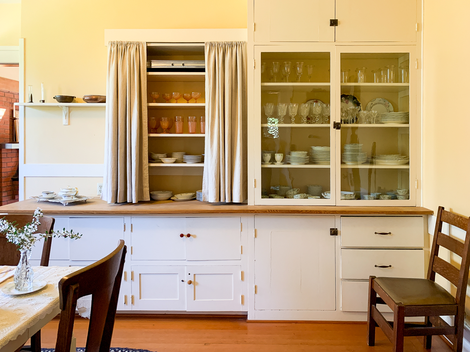
Just off of the dining room is the butler’s pantry where the cooks would plate and prep food to serve dignitaries in the likes of Teddy Roosevelt. Fun fact: Booker T. Washington ate in the dining room where the first chapter of the San Diego ACLU was formed!
I’m struck by the open shelving - a style we commonly deem a modern kitchen design. Going cabinet front free allowed multiple staff members to move throughout the space without bumping into an open cabinet door while someone was reaching in to grab a platter. To keep the plates clean and free of dust, curtains could be pulled to cover the items. The shelving units nearly touch the floor but they’re elevated to keep floor sweepings away from the tableware and to reduce corners next to the cabinets where dust could collect. Genius.
What I also love about the cabinets is the asymmetry of them. When designing my kitchen I try to line everything up so its perfectly balanced, yet I gravitate towards asymmetry in other kitchens. Maybe I need to re-think my layout, now?
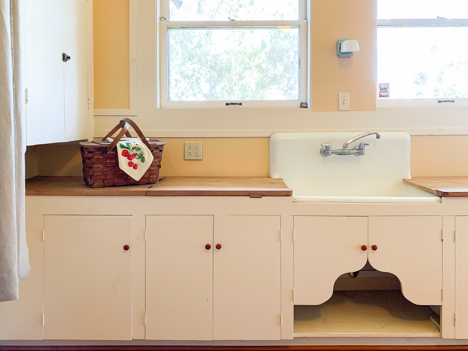
Those gigantic windows kill me. It doesn’t translate as well in photos, but those are about 8 feet wide. The sink centered between two windows reminds me of my current kitchen, eh?
The floors in these spaces are Douglas fir, a less expensive wood that was used because guests didn’t go in the cooking spaces so it didn’t need to be as showy as the oak throughout the rest of the house. The notion that guests never come into the kitchen is ridiculous nowadays, but I like the idea of a kitchen being less precious and more of a utilitarian space with materials to reflect the wear and tear of the workspace. (Side note, fir flooring is soft, so it’s unfortunately really good at showing off wear - so it isn’t a material I’m planning to use).
At the sink are wood countertops that have been shaped to allow water to drain into the sink. Can you see the curve in the counters on either side of the sink that slope inward? This made for easier clean up and prevented water from sitting on the porous surfaces.
My favorite part of the countertop drainboards is they lift up to allow easy access to the cabinetry below. Genius and so secretive! Nowadays we have drawers for cabinets, but I appreciate that the architect was already thinking of easy cabinet access 114+ years ago. Why this idea didn’t become more mainstream is beyond me. It’s a bummer we lived without drawers or lift-up cabinets for a century!
The sink cabinet is exposed to allow ventilation and maintain visibility to the plumbing. Concealed plumbing leaks would lead to mold which is never good, but particularly unfortunate in an era without modern-day healthcare. Plus, look how charming that cut out is.
The cabinetry is all inset, meaning the doors don’t sit on top of the frame of the cabinet, but rather flush with them. It’s a look that we drifted away from but is coming back in vogue. In the butler’s pantry, the doors are simple with flat fronts, but in the kitchens, they’re shaker style.
I’ve been showing off mostly the butler’s pantry, but I’ll move into the main cooking kitchen, now.
In the center of each rooms is a small table where staff could plate dishes or where folks could dine less formally. I really like the feeling that a little dining table evokes in a kitchen - its so comfortable and familial.
Side note: You may have noticed that the kitchen was updated in the 1930s (I’m looking at you, tile counters!) so it’s not totally true to its 1905 design.
I like the look of this cabinet with a long work surface and overhang. I never thought much of how our modern-day islands with an overhanging countertop could be at all related to old architecture until I saw this one. I’m not totally sure the purpose of the overhang on the right, but I’m guessing the overhang on the left is to allow access to the cabinet in the corner. Yay for no wasted space!
The walls are open and uncluttered. Many old houses were full of cabinetry, so this particular house is an example of a move towards simplicity. Here, there’s ample breathing room on either side of the windows and along the ice box wall. There’s room for towel bars, hooks, or artwork. Again, I’m so used to open shelving and cabinet-free walls looking modern, but here they are 114 years ago. Swoon.
The ice box isn’t something I’m advocating for returning to, but I want to point out the ahead-of-its-time environmental grey water system. As the ice melted, it dripped into a pipe that routed outside to a giant cistern where the water was collected along with roof rain water runoff to be used as irrigation. Genius and so environmentally conscious.
I use my air conditioner condensation to water my garden - yay for gray water! - here’s how.
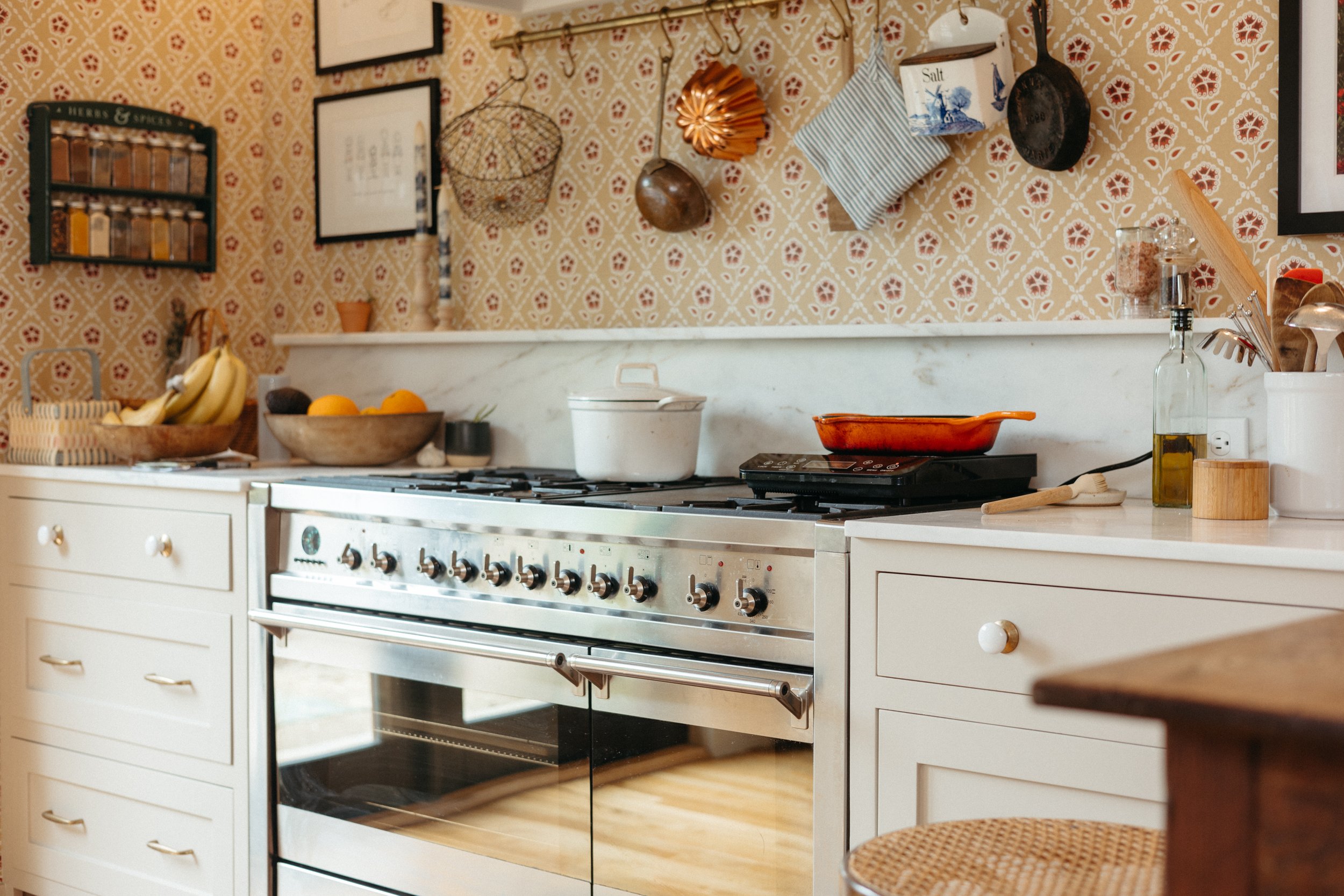
Ohhh that range. For years we’ve been hiding our appliances or making them into simple little workhorses, but we’re moving towards embracing appliances more with statement appliance. Are you enjoying the popularity of colorful statement ranges, too?
Off the kitchen is a California cooler which is a “cool” feature that I won’t be able to integrate into my kitchen, but I love the efficiency of it.
The vent in the back is shaped to collect the cool ocean air and release the warm air out the top. It may seem unbelievable, but this room is truly several degrees cooler than the rest of the house - even on a hot summer day.
I don’t know why these tilt-out bins went out of fashion, but I think they’re so slick.
Lastly, by the sink are built-in soap shelves. Why are we still storing soap on our counters, people?!
The house is unique in being one of the few public spaces in San Diego showcasing early architecture, but it also happens to be where Ross and I got married, so it’s a special spot for us, too. I’ve recently started volunteering at the house by giving tours of the architecture and the history of the socially responsible family. Stop by the next time you’re in town!
Photo by Stacy Keck


