The Evolution of the Vestibule
/We added a wall in what some folks would think is a wonky way. But, it’s come together so much more perfectly than I could have hoped! Here’s the evolution of a transformation that’s re-shaped the flow of our house.
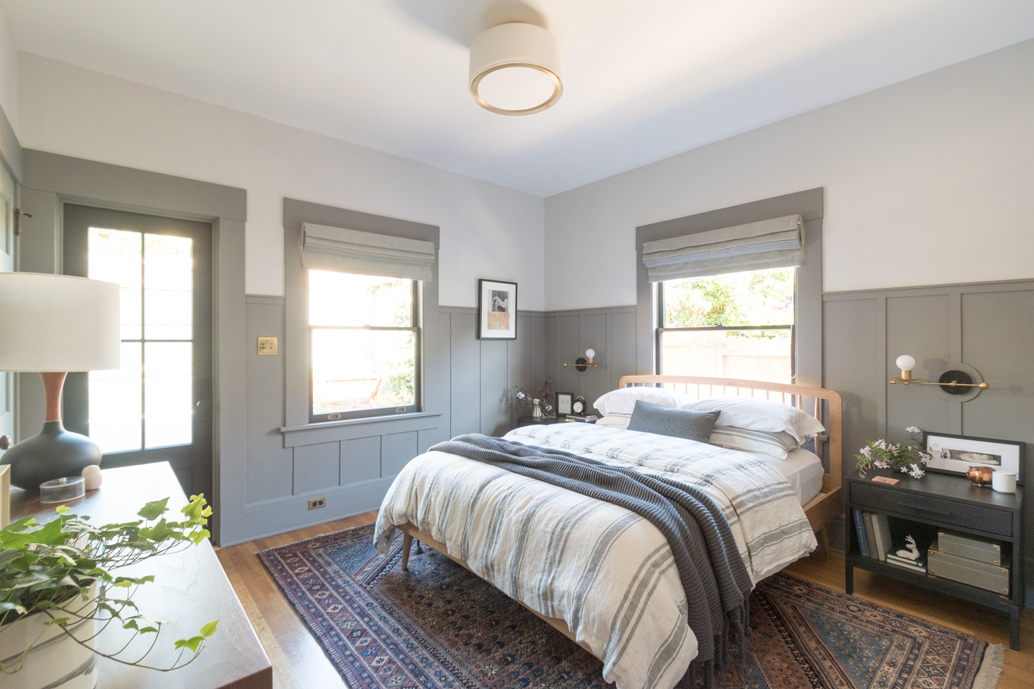
Our home has always had really great flow. When we first bought the house, all of the rooms connected in a circle so you could loop through the house from room to room. It’s so nice having that circular flow - the house feels so much bigger than it is! In 2018, I closed off the opening from the kitchen to the bedroom which allowed more usable space in the bedroom. However, this closed the circular loop and made the primary bedroom only accessible by walking through the den.
See how the house flows in this 4-minute non-narrated walk-through video. You can see house tour walk-throughs from 2018 and 2015 here.
The changed floor plan was a perfectly fine layout for us when we used the den as an extension of our bedroom. But, we knew we’d want access from elsewhere because, according to local code, a room isn’t considered a bedroom if it’s only accessed by walking through another bedroom.
Enter, the “vestibule” design.
When designing the kitchen, I also redesigned the access to our primary bedroom - plus, I added a second bathroom and reconfigured the bedroom closet. In order to accommodate the changes, I borrowed space from the den (now the nursery) to create what I refer to as “the vestibule.”
Technically speaking, a vestibule is defined as a space that transitions from the outside to the inside. The “vestibule” in my house doesn’t take you to the outside so it isn’t technically a vestibule, but that’s fine with me. Don’t come at me for misusing a word (unless you have a better one)!
Our vestibule is like a mini hallway with three access points, the nursery, the bedroom, and the closet. Well, actually it’s four access points because the closet is a hallway to the kitchen. The addition of this mini hallway has so many perks!
We meet our local code’s requirement of access, so now our home is back to being considered a 3 bedroom home.
The home has regained its circular flow allowing us to walk in one loop and hit each room of the house. I look forward to the day little Margot runs in circles throughout the house!
We still have great access from our room to Margot’s nursery.
The primary bedroom uses the vestibule as an extension of the bedroom and the closet, giving the room a feeling of being bigger.
The pocket door between the kitchen and the closet creates a division between our living and sleeping areas, but the vestibule wall visually hides the bedrooms if the pocket door is open.
The vestibule turns unused space in the nursery (it only acted as a hallway from the hall to the bedroom anyway) into a useful part of the house.
The vestibule paired with the pocket door creates a “light lock” that allows us to go into the nursery without opening any of the nursery doors into the bright light. Perfect for escaping into darkness when we put Margot down for a nap!
I could go on, but I love this little addition! It admittedly felt weird at first, and I know a lot of people poo poo’d the idea, but there was no better option, and I considered aaaaall the other ideas.
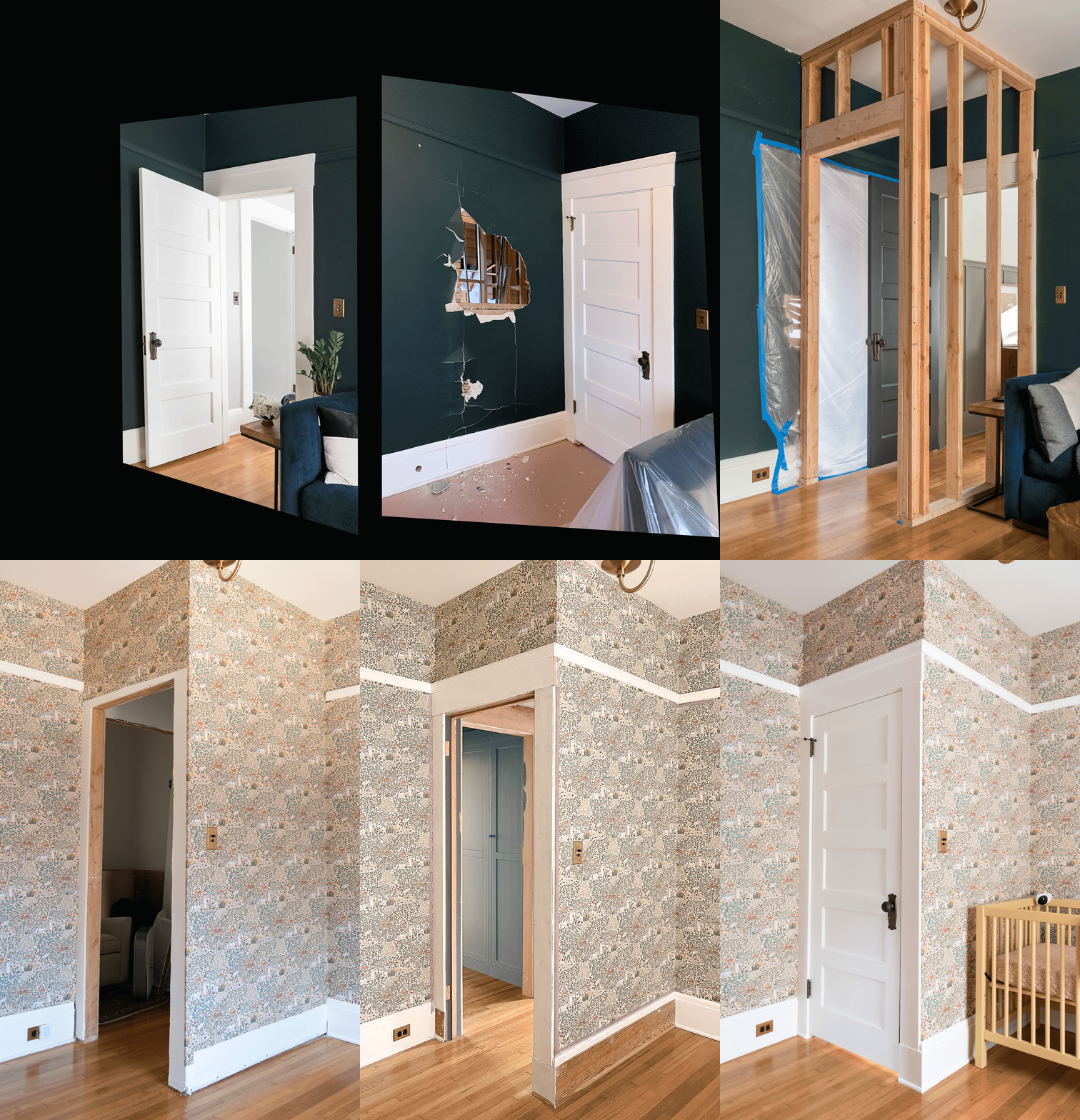
Anyway, here’s a fun evolution of the construction process to see it transform.
Above is a photo from 2017. It’s a view from the den looking into our primary bedroom, with the kitchen off to the left. We later closed off the opening to the kitchen when I renovated the primary bedroom.
During the kitchen renovation, we cut a hole from the kitchen construction zone into the den. It looked ridiculous, but the plan was just getting started. This hole will later serve as the transition from the closet into the vestibule.
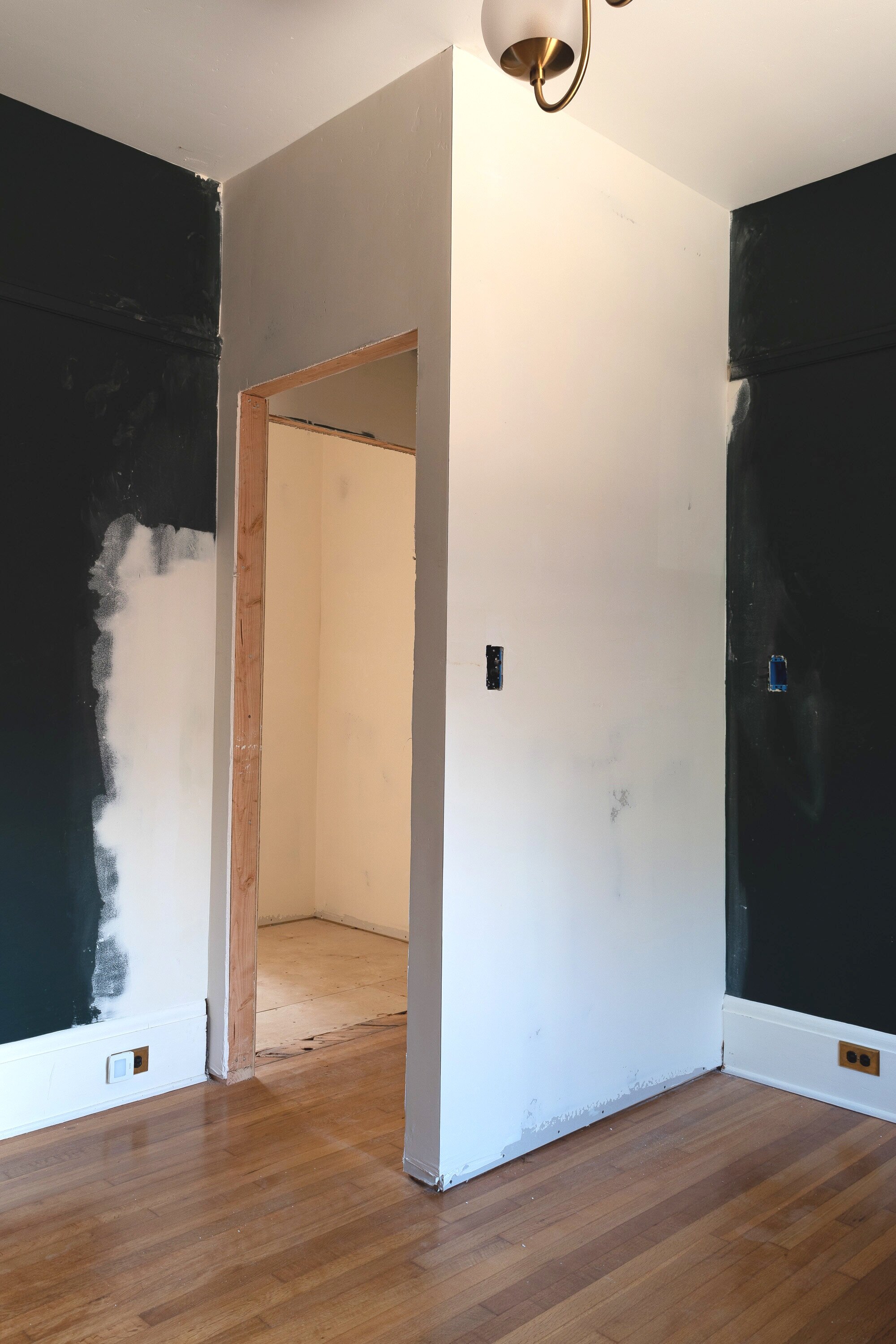
Then, we framed out the vestibule in the corner of the den. The opening from the kitchen is behind that plastic tape on the left. The black door is swinging into the space in an odd fashion. We’ll remove it later in the process and repurpose that door as the door from the nursery into the vestibule.
At this stage, the vestibule seems like a terrible mistake. It looks like a modern monstrosity in an old house and feels completely out of place. oof. The lack of flooring in the closet doesn’t help.
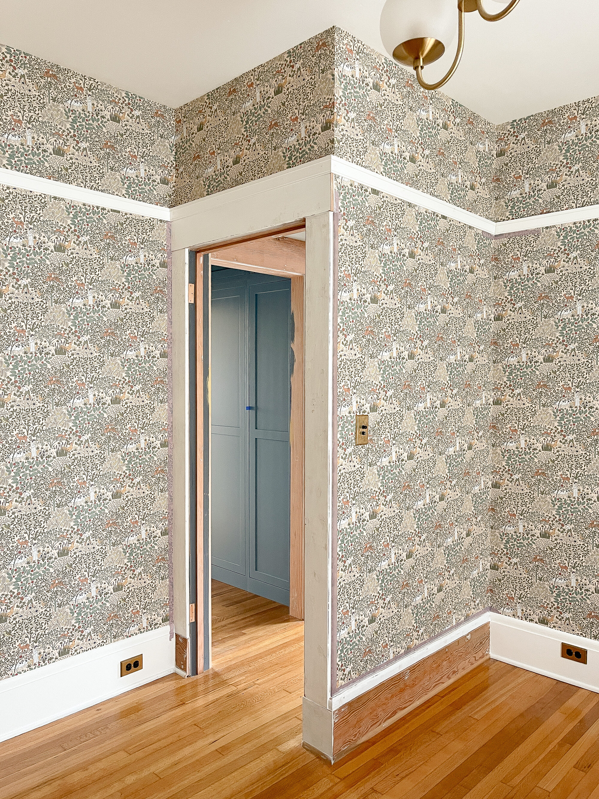
Then we added wallpaper and it started to look like the walls connected. It still looked out of place, but the vision is easier to see now, right? The closet was used as a storage room until the cabinetry goes in.
What every old house renovation needs is millwork that’s to scale and fitting with the original profiles. I salvaged scrap lumber from the kitchen demo and pieced back the baseboard, door casing, and trim details. Hazzah!
In the background, you can see that the newly installed hardwoods blend seamlessly and the closets have defined the space as a hallway with useful storage on either side. Getting there!
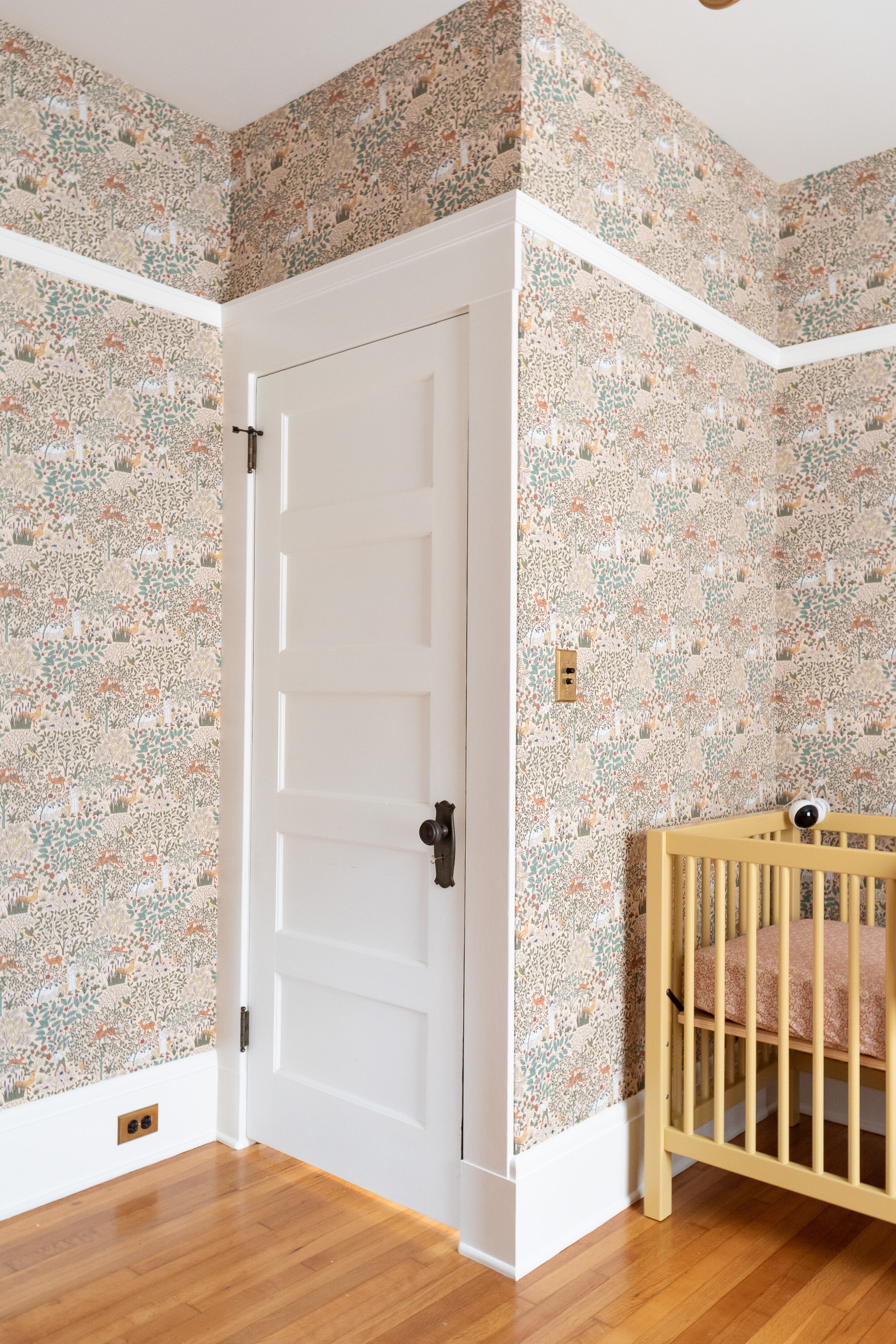
Then, the woodwork got painted, the salvaged door was hung, and the hardware was put in the closet! It feels so fitting, now! If I didn’t explain this whole process, maybe you wouldn’t even know this wasn’t original?
We’re so pleased with how the house flows now. Its back to being a loop connecting all of the rooms, but now the space is maximized with a closet and room for a second bathroom - all without compromising the design of the kitchen nor the functionality of the nursery.
Here’s a fun animation of the vestibule coming together:
And below is a view from the nursery looking into the primary bedroom.
Stay tuned for full reveals of each room soon!


