The Before Tour of A Narrow Galley Kitchen Tight on Storage and Function
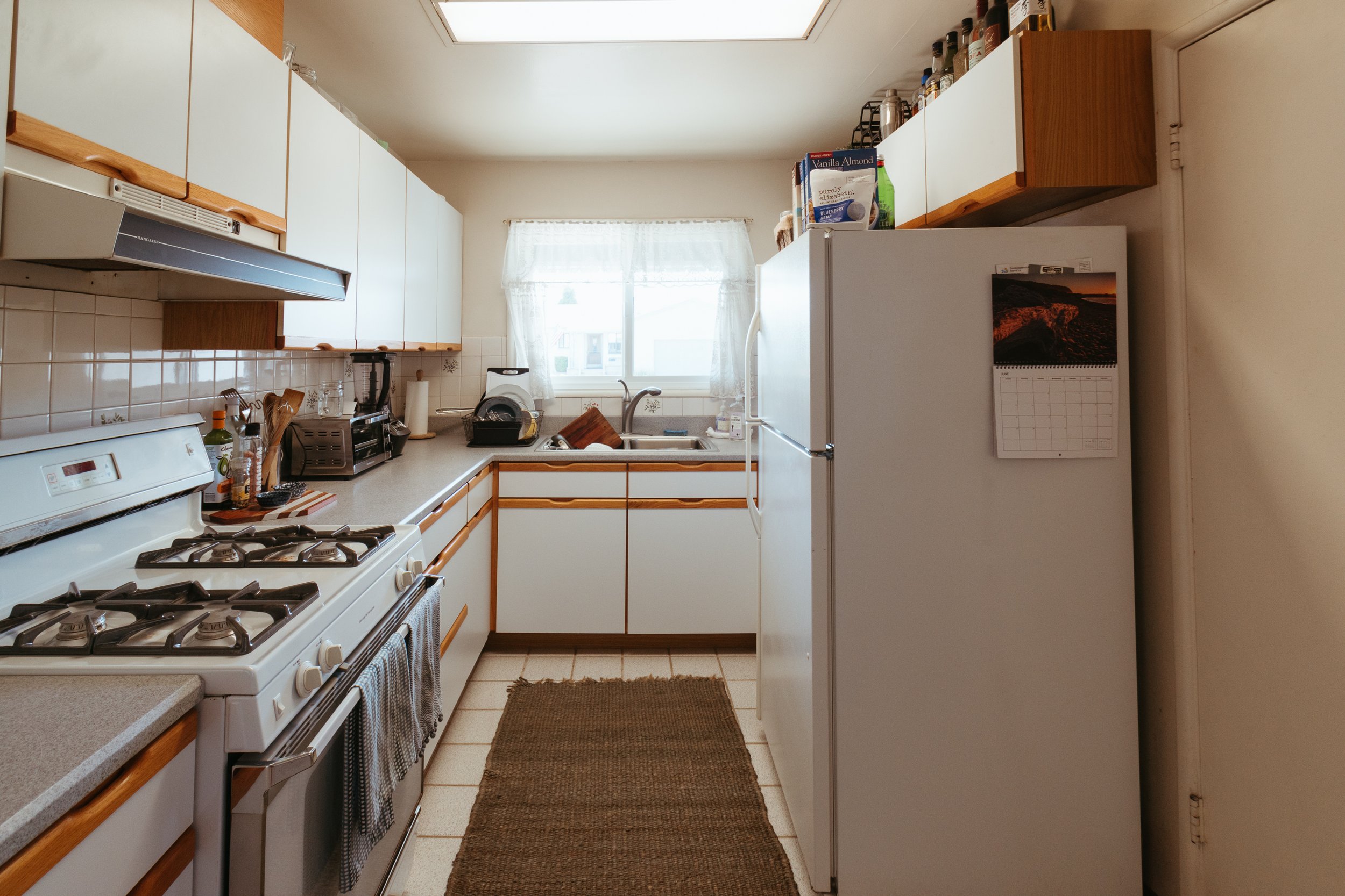
/My friends’ kitchen is narrow, dark, cramped, lacking storage, and has underutilized space. So, I’m working with them to transform it! Their existing space is a typical small kitchen and I’m proud to show off how we’re improving the space without dramatic structural changes.
This series is in partnership with iCabinetry who is one of the few companies that makes inset cabinets that can be ordered online and arrive pre-assembled! The quality is top notch, you get a pro kitchen designer included, and the process is truly hassle free. As always, all words and opinions are my own. (Keep reading for a coupon code for 35% off your new kitchen cabinets, too!)
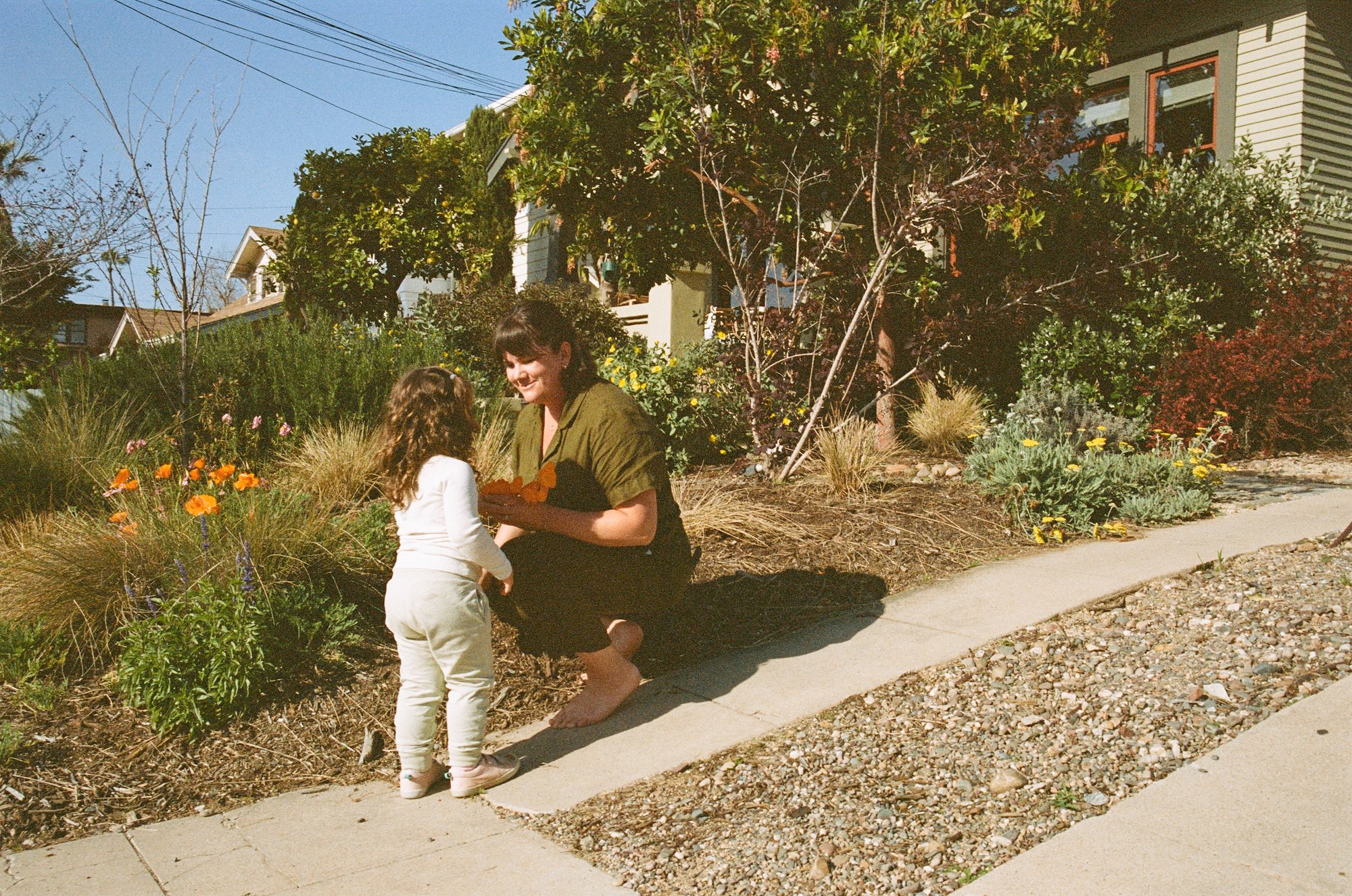
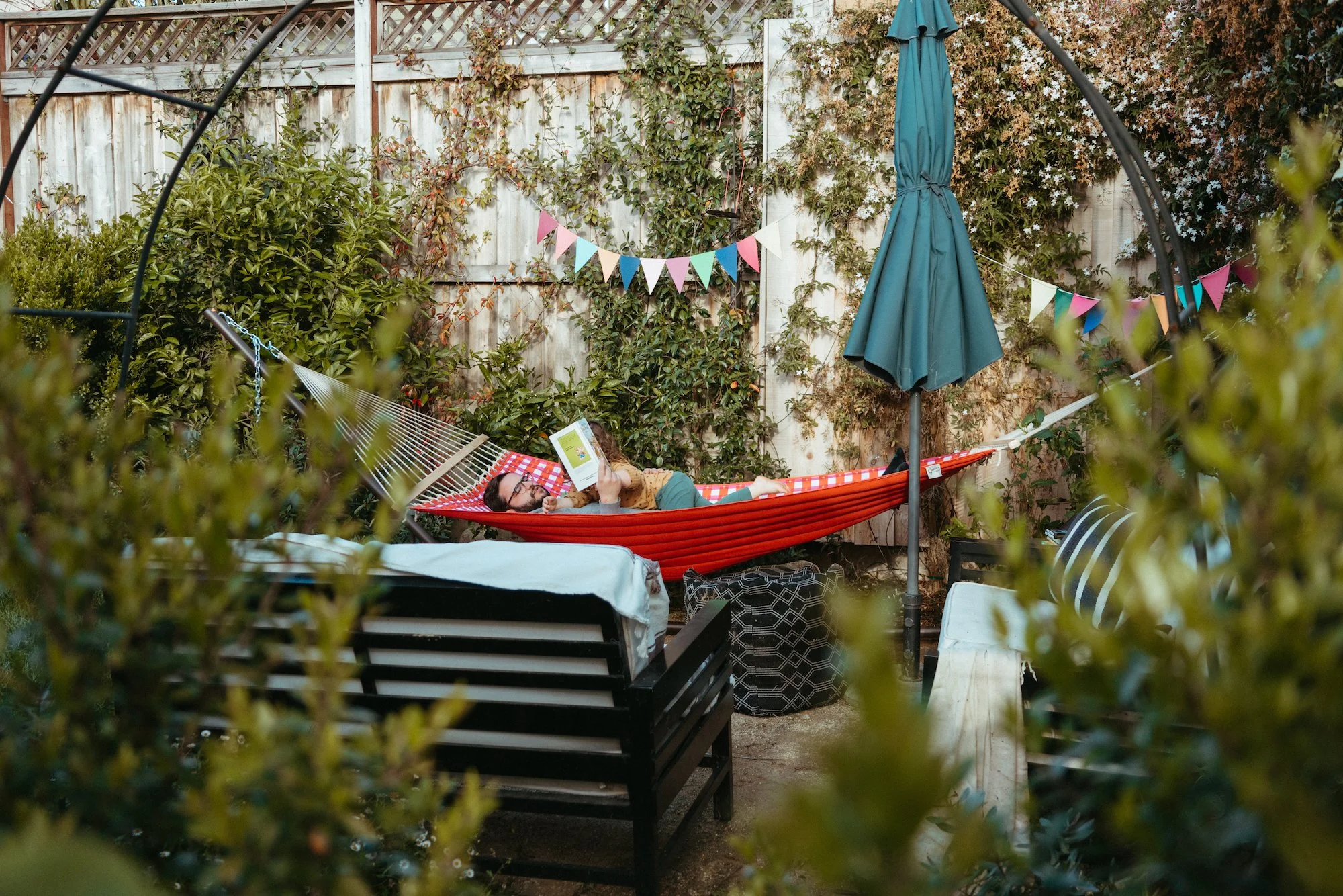
Before we get into their kitchen, let me introduce you to my dear friends Caroline and Alex. Caroline works in research for public policy organizations and Alex works in education. They live in San Diego with their feline, Mr. Cat. After editing the photos for this blog post, I’ll say that they could also have futures as models. I mean, Caroline even makes the “before” kitchen look amazing with that grin.
We’ve grown close over the past few years, bonding during outdoor hangouts and socially distanced pizza dinners in backyards. When they bought a house in 2020 after hunting for a while, I was thrilled to see them start turning it into a home. They got to work right away updating the tired 1960s ranch-style house into a home fit for a modern young couple (and family! - stay tuned ;) ) They renovated a bathroom, painted all of the living space walls, and created a wishlist of other projects including refinishing hardwood floors and landscaping with native plants.
At the very top of the wishlist? A new kitchen.
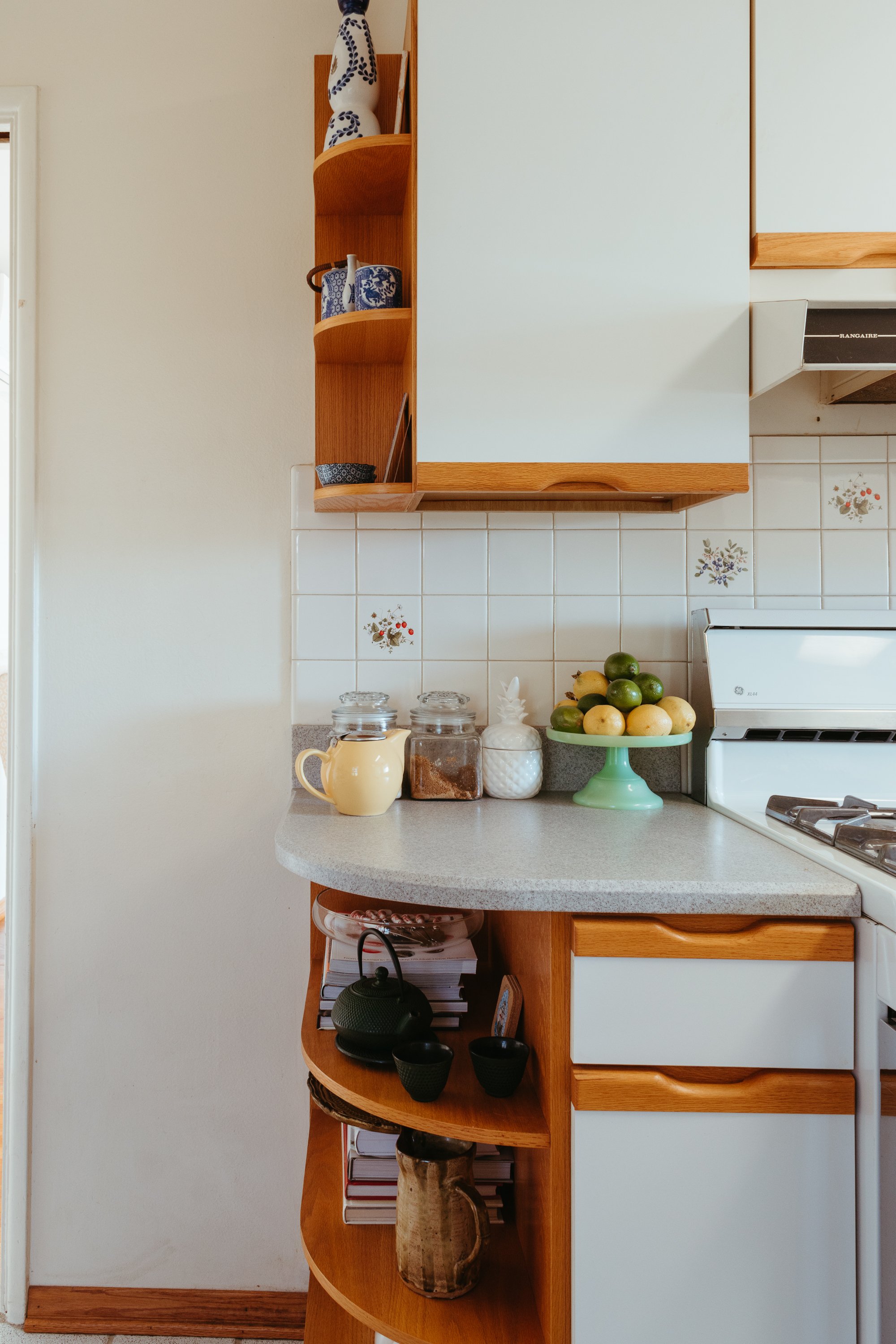
The old kitchen is actually quite charming! I genuinely dig those floral tiles. And Caroline made the space homey by displaying handmade pottery and collectibles from their travels.
But the room is cramped! Alex can’t get into the fridge while Caroline is at the sink.
Nor can they open the fridge and oven at the same time.
Tight quarters are one thing, but Caroline and Alex enjoy cooking together, so this kitchen doesn’t fit their lifestyle.
The sink is situated under the window, which is nice in theory, but there isn’t any room for a much-desired dishwasher with this configuration.
And the oversized fridge takes up most of the kitchen. Situated smack in the center, and deeper than the cabinets, it protrudes into the highly-trafficked area.
The fridge’s location is only made worse by having a door to the garage in the perfect spot for a work surface.
The door to the garage divides the kitchen into two spaces: the cramped cooking area and this hodgepodge spot where they store the litter box and the overflow kitchen items that don’t fit in the cabinets.
Surely this area would have been used as a cute breakfast nook, but Caroline and Alex prefer eating at their dining table. And what they really prefer is cabinets that can accommodate their modern-sized appliances so their mixer, soda stream, and pantry items don’t need to be on display on a bookcase.
Not trying to give any spoilers, but ahem - spoiler! Don’t you think this view would look so nice with a glass door that opens up to the backyard? It would create a Southern California indoor/outdoor connection, aid in overall flow, and would flood the kitchen and dining room with light.
For more context on the size of the kitchen, the floor space in front of the fridge is literally two cats wide. That’s shy of three feet for anyone that doesn’t measure by feline length.
In addition to the layout challenges, the cabinetry is a major pain point. The wood and white combo on the doors isn’t their style, and it also doesn’t function well for them.
These tight kitchens give me such an appreciation for the people (mostly women!) that cooked family meals in here multiple times a day. They did so much with such little space - I wish they had more room!
The upper cabinets leave wasted space up top and they’re hung too low. Many of the drawers don’t open more than half way and they don’t provide the proper storage they need.
The lack of cabinets next to the door just seems rude.
You get the gist! This kitchen is due for a revamp and deserves a fresh layout.
The overall size of the kitchen can’t be modified due to budget constraints and goals of maintaining the rest of the home’s flow. We aren’t going to tear down any walls or expand into another room - no HGTV open concept, no vaulted ceiling, no over-the-top appliances. I’m excited to show off a kitchen with a petite footprint undergoing a modest renovation.
When Caroline mentioned they were going to tackle the project, I volunteered myself to help out. I love reimagining spaces and I already put in many hours researching and sourcing good cabinetry. If you remember, I ordered cabinets for my kitchen and they never arrived, so I went down a rabbit hole of sourcing cabinets that I could order online that fit the classic style that I wanted. So many online cabinet providers are limited in what they provide, so I recommended Caroline check out iCabinetry and their beautiful collection pre-assembled cabinets that come in a variety of door styles. Plus, they make inset cabinets which is not supper common! (more on that later.)
Here’s a sneak preview of the design, but stay tuned to see more of the cabinetry shopping process and follow along for the full renovation, it’s a good one!
Get 35% off your new kitchen cabinets!
Use coupon code GOLD35 for 35% off your kitchen cabinetry! Have iCabinetry design your kitchen this winter and get fresh cabinets come springtime! Mention the coupon code to your designer during your first call and they’ll apply the discount to your new cabinets.
Update! This project is complete!
Check out the cabinetry design and installation post here, and admire the reveal photos here.


