Upgrading Cabinetry to Transform a Kitchen
/There’s always that one thing that transforms a kitchen - tearing down a wall, adding a skylight, incorporating an island - but in this kitchen, it’s cabinets. The power of new cabinetry in a fresh layout is a game changer for a kitchen with limited space!
This series is in partnership with iCabinetry who is one of the few companies that makes inset cabinets that can be ordered online and that arrive pre-assembled! The quality is top notch, you get a pro kitchen designer included, and the process is truly hassle free. As always, all words and opinions are my own. (Keep reading for a coupon code for 35% off your new kitchen cabinets, too!)
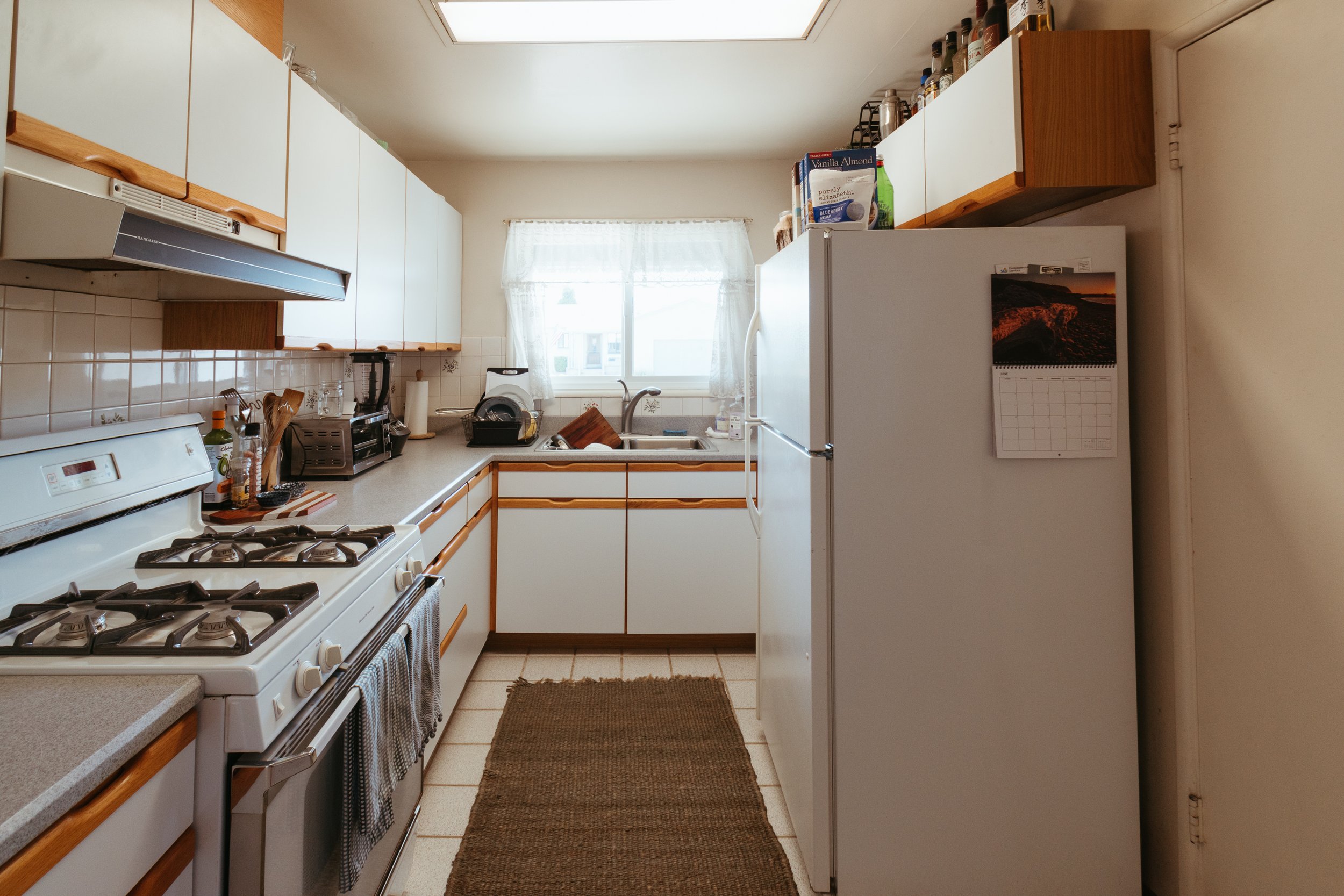
As a reminder, here’s the kitchen we’re working with. It belongs to my friends Caroline and Alex who are tired of the cramped and inefficient space.
It’s a snug area with less than 3 feet between the fridge and the oven, cabinets that don’t fit their appliances, a bookcase for overflow pantry items, and a door to the garage that hardly gets used.
When Caroline mentioned they were going to tackle the kitchen, I volunteered to help reimagine their space and the first thing I recommended was inset cabinets from iCabinetry.
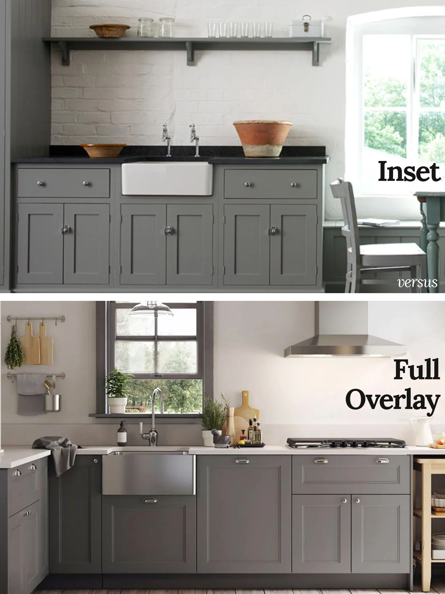
Above is an example of inset cabinets compared to modern overlay styles. I’m a big fan of classic inset doors that sits flush with the frame of the cabinet box. This was how cabinets were made when my 1915 home was built, so I particularly like the historic quality of them. But, even in homes that aren’t 100+ years old, inset cabinets provide a very intentional, curated, custom feel.
All this to say that these cabinet doors aren’t available just anywhere. You used to have to go custom to get this classic style, and the big box stores still don’t provide inset cabinetry. But iCabinetry does!
In a small kitchen that needs lots of storage, we knew cabinets would be the primary focal point. So, we focused on giving the main design element some personality with a unique door style, a pretty color, and the classic quality of inset panels.
I went with a simple shaker door style in my personal kitchen, but Caroline and Alex picked a cool design that you truly don’t see everyday. I’m kicking myself for not exploring the variety of door styles for my own kitchen.
The three of us sat down for a few brainstorming sessions to assess their kitchen goals. We weighed the pros and cons of opening up the wall to their living space, discussed adjusting doorways and moving windows, and decided what to do about that pesky door to the garage.
I came up with a few designs that involved widening the doorway to the living room or nearly entirely removing the wall. My initial design was to create an eat-in kitchen with a dining table situated where the wall is. However, Caroline and Alex decided it wasn’t in the budget, nor did it dramatically benefit the flow of their home.
So, we kept the wall between the living room and kitchen. But we did decide to remove the door to the garage as well as replace the window with a patio door. It’s a no brainer for accessing their lovely yard and outdoor eating area from the kitchen. Don’t worry, they still have super easy access to their garage via a side door that’s mere footsteps from their new patio door.
With a solidified footprint, Caroline sent off a doodle of the floor plan to iCabinetry and let the dedicated designer handle the rest.
When I remodeled my personal kitchen, I put in an excessive amount of time researching, pretending I was a cabinetry designer (I’m not!). It was time consuming learning the variety of sizes of drawer pullouts, fitting interior storage, and understanding how trim and filler pieces fit in. Even as someone who loves design and research, I don’t recommend becoming an amateur kitchen designer if you don’t have to.
iCabinetry made it easy - just send the room dimensions and wishlist, then a pro designer crafts a perfectly customized space using standard cabinet sizes.
While the iCabinetry designer was working on the details of the layout, she sent us some samples from which we could select the finishes. We asked for pale blues and greens to go with Caroline’s goal of cooking in a “farm cottage in the Italian countryside.”
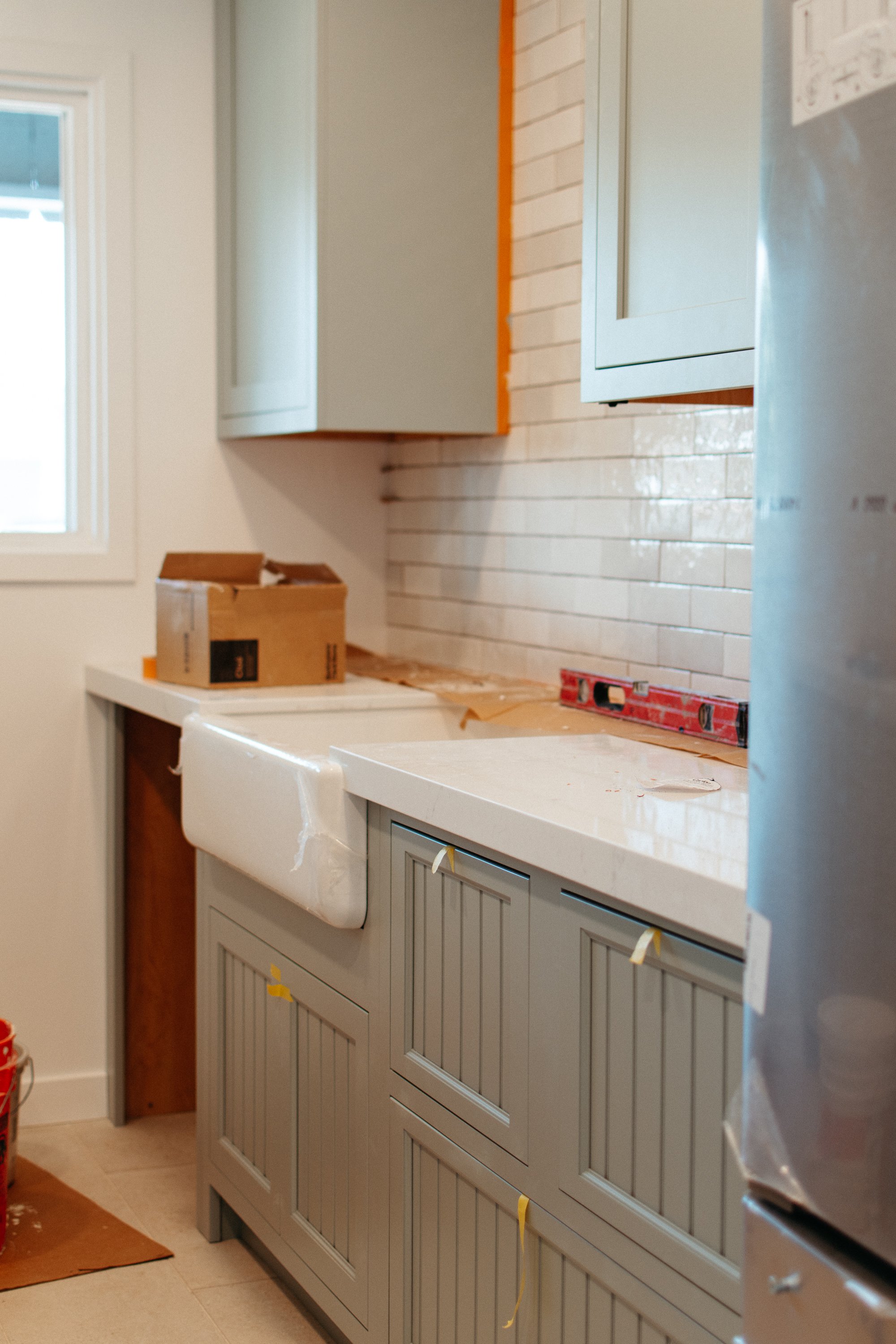
iCabinetry mailed us pieces of cabinets with the high-quality finish on solid maple. Such an upgrade from staring at tiny paint chips! There are over 60 color and stain options, but we chose the color Crystal Fog on the Lafayette door style.
We paired the cabinets with a white quartz countertop and a travertine-look porcelain tile. The finishes come together to give a nod to a small Italian farmhouse, with a modern update. Perfect for them.
Not long after Caroline sent measurements to iCabinetry, her dedicated designer sent a fresh kitchen layout complete with renderings and a detailed cabinetry plan for installation.
The before and after layout is wildly transformative!
What an improvement! The new layout feels more spacious even though the room wasn’t widened. There’s a dishwasher! The sink is bigger. The flow to the backyard is ideal. The counter space is doubled. The cabinets fill the walls. The layout welcomes multiple chefs and a proper cooking triangle.
In addition to a better layout overall, the designer planned the cabinets strategically and incorporated modern amenities. There’s a spice rack, a spot for baking trays, and plenty of drawers - but more on that later.
While the design was nearly dialed in, we did do a revision or two which iCabinetry happily accommodated and adjusted before placing the order.
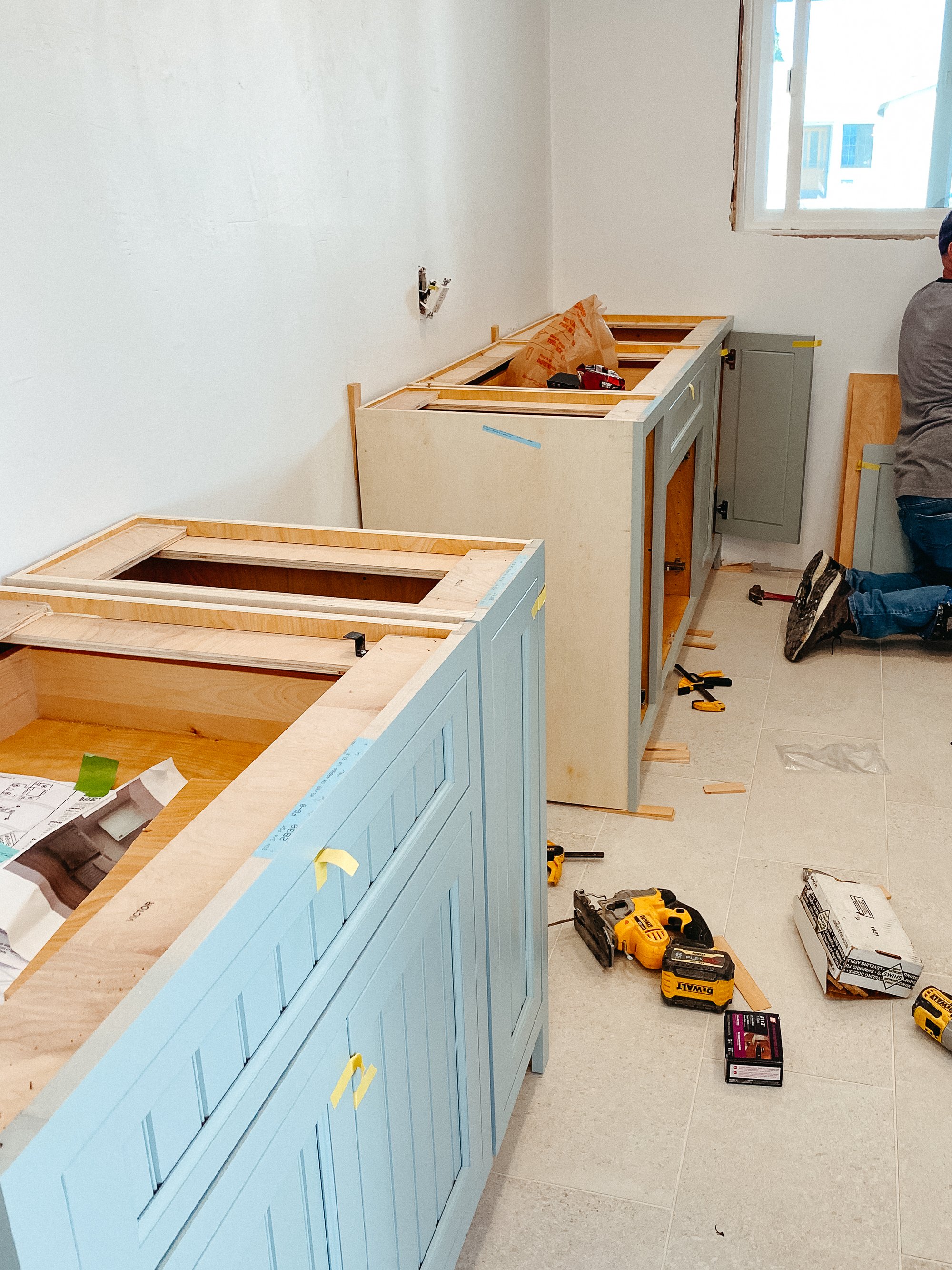
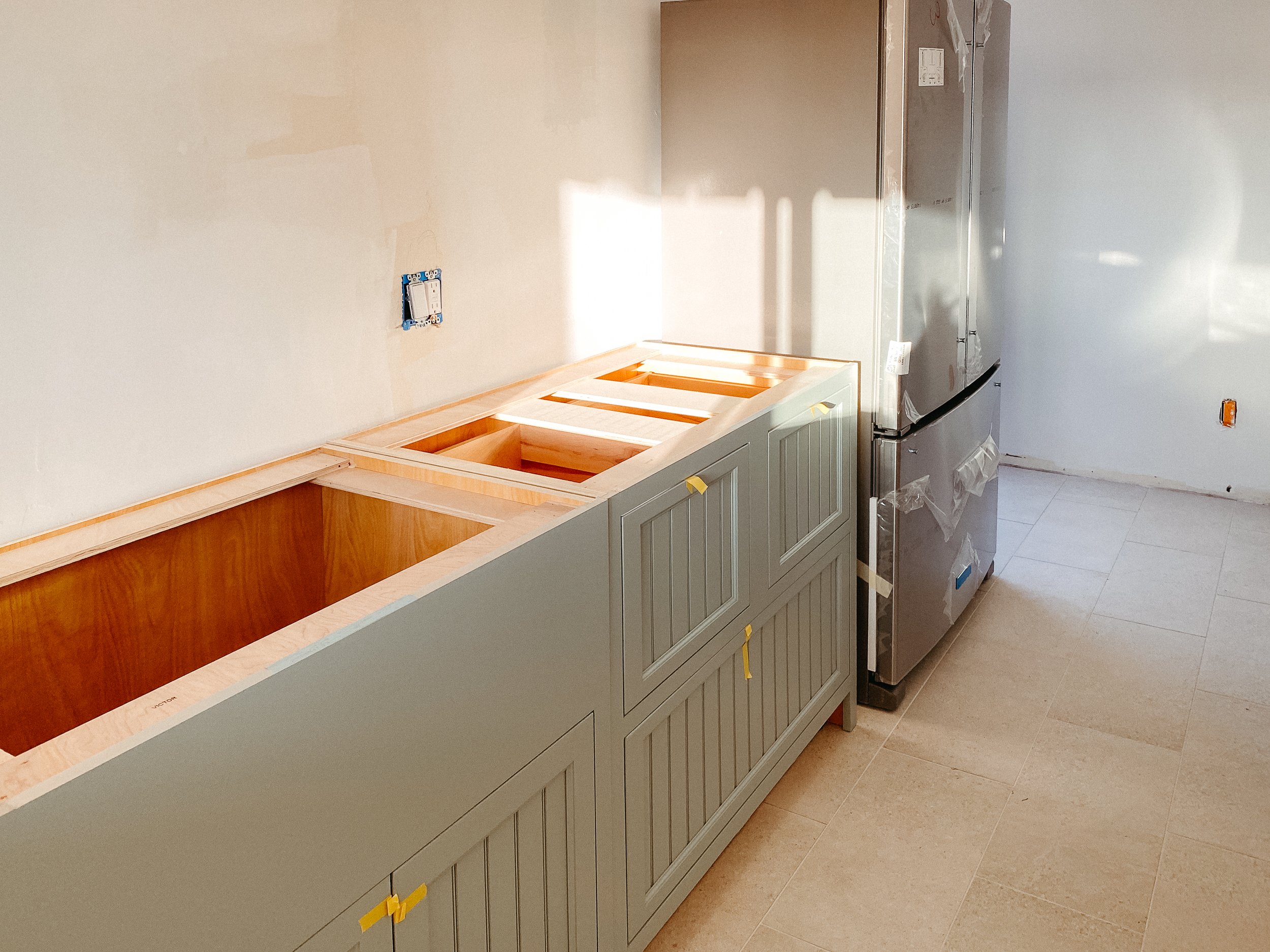
Did I mention that all of the solid wood cabinets came pre-assembled?! No jigsaw puzzles of putting flat-packed boxes together, just simple boxes. Even the doors and drawers are installed and adjusted to fit before being put on a truck to be delivered.
Caroline’s contractor put the boxes in place, leveled, and secured, them. Then, he fine tuned hinges and installed hardware. He used the installation guide provided by iCabinetry which outlined placement and use of filler pieces.
While Caroline and Alex opted to have a contractor install their kitchen, these cabinets are perfect for a DIYer because so much of the messy guesswork is taken out of the process - from design to installation. This is definitely the route I would go if I ever do another kitchen for a personal home.
Their iCabinetry designer so smartly reimagined the flow by moving the sink from under the window to a long wall so we could fit a dishwasher. With a window at the end of the galley, it feels like chef Deb Perlman’s kitchen - a classic New York apartment that’s efficient, utilitarian, cozy, and without frills.
The cabinets we selected are the iCabinetry Lafayette Inset made of solid maple and painted in Crystal Fog. They have the prettiest detail that adds a unique texture and provides something extra to the small space without overwhelming the room. I can’t wait for you to see the full reveal and the smart storage we’ve snuck in.
Can you see it coming together?? Stay tuned for the full reveal of the kitchen coming next!
Update: here’s the reveal!
Get 35% off your new kitchen cabinets!
Use coupon code GOLD35 for 35% off your kitchen cabinetry! Have iCabinetry design your kitchen this winter and get fresh cabinets come springtime! Mention the coupon code to your designer during your first call and they’ll apply the discount. Psst! They’ve generously extended the discount, so don’t hesitate to reach out!


