One Room Challenge Week 1 - A Foliage-Filled Home Office
/Do you remember that time earlier this year when I transformed our den? That time when I painted the walls a deep moody green, installed picture rail molding, reupholstered a chair, sourced new art and furnishings, and also blogged all about it? That time when I did all of that in a matter of six weeks? Well, if that wasn't enough speedy home design for one year, I'm doing it again this fall!
That's right, I'm participating in the One Room Challenge for the second time! I've selected another neglected room in our house to completely redesign. Eek!
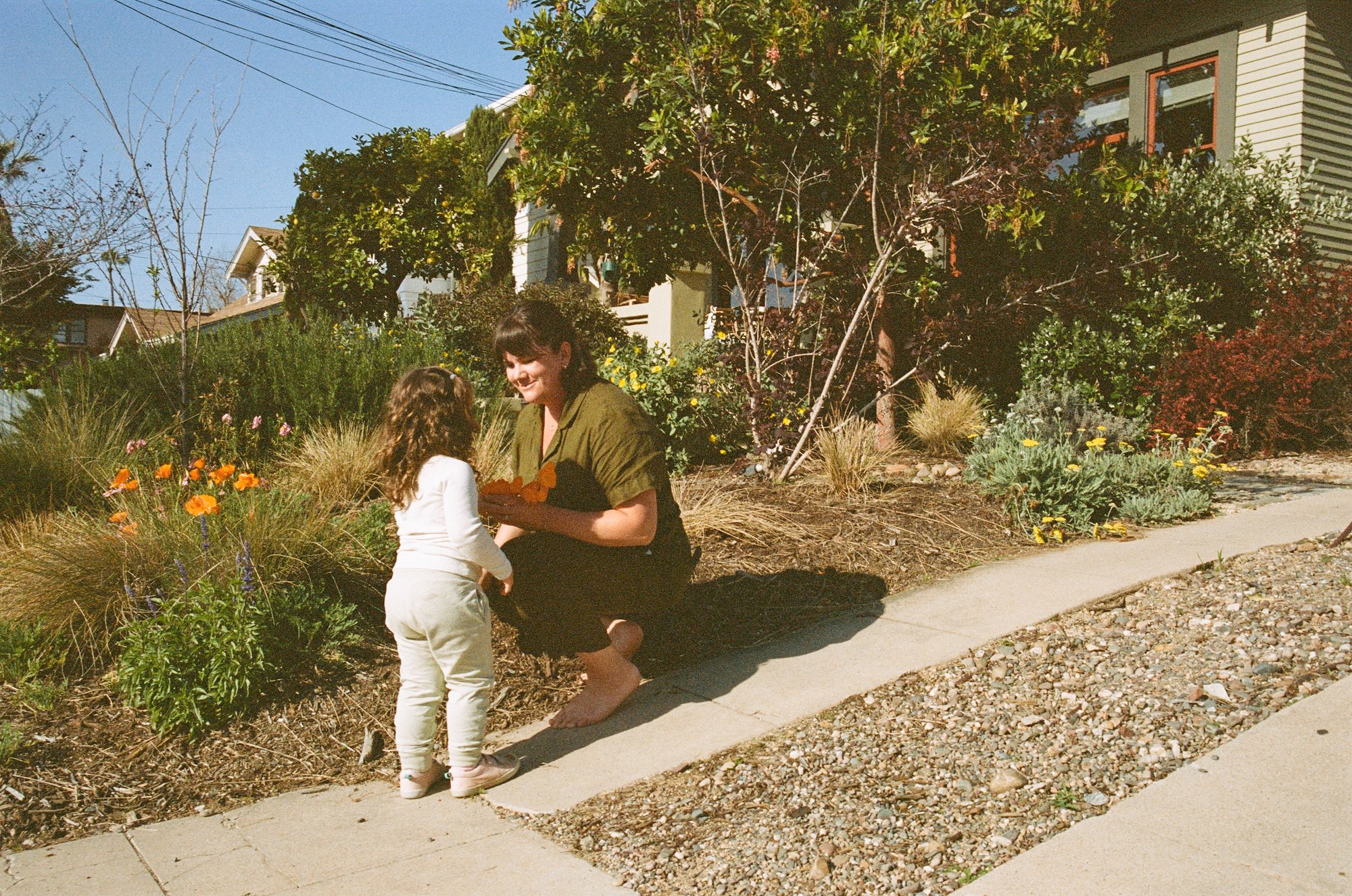
If you found me through ORC, welcome! I'm Ashley and for the past two years, I've been restoring a craftsman bungalow in San Diego, CA. Learn a touch more about me here, and preview the before-and-after room transformations here.
Our home office is the most neglected room of the house. It didn't even earn a viewing in the recent Design*Sponge feature because it's too darn bland.
Before I get into what the home office looks like now, I'll give you the plan and the inspiration first!
The biggest part of the transformation is the wall treatment. I'll be hand-painting a mural on all four walls of the room with pretty grey tones!
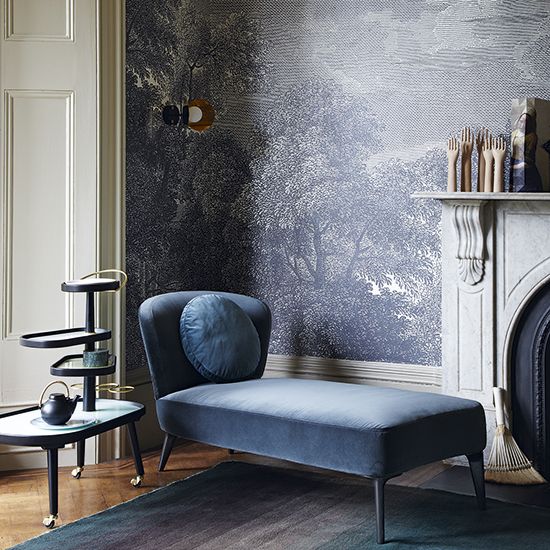
I was inspired by these wallpapers that mimic etchings.
In search of a unique etching, I went to The Met's open source catalog of art and selected this beauty. After a few tests, I decided the etching look wasn't the best option for hand-painting a room in six weeks, so I've modified the image to mimic a paint-by-numbers.
I'm exhausted just thinking about painting eight different greys on each wall in the likeness of that etching, but I can't wait to see the final result! I hope you'll follow along!
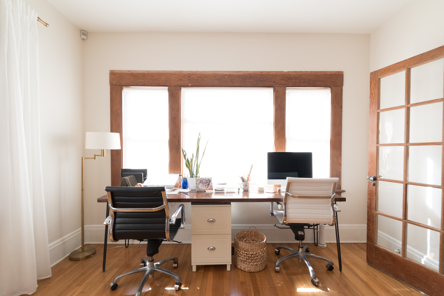
Since I know you're itching to see the befores, here you go!
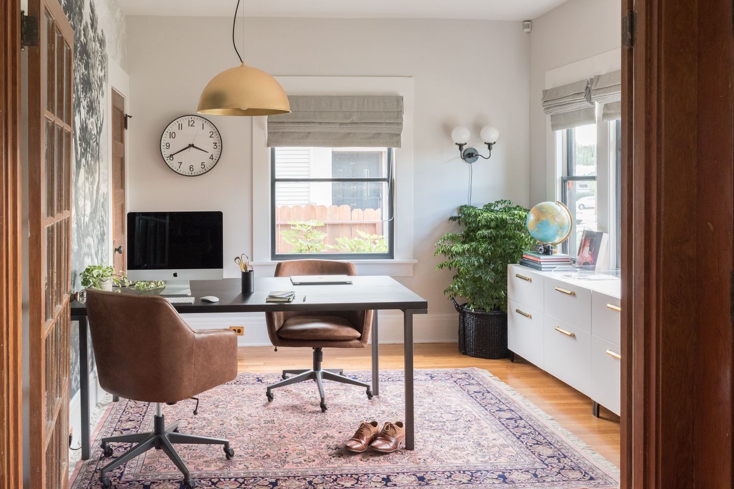
I built the desk about five years ago to fit in our old house. The size works, but the sunshine from the window is a killer. It's so bright and hot that I feel like I'm working on the surface of the sun. So, problem 1: desk orientation.
The desk orientation is unfortunate for ocular-comfort, but it also doesn't do anything for the layout of the room. We have a big open space in the middle with absolutely nothing going on. Problem 2: room layout.
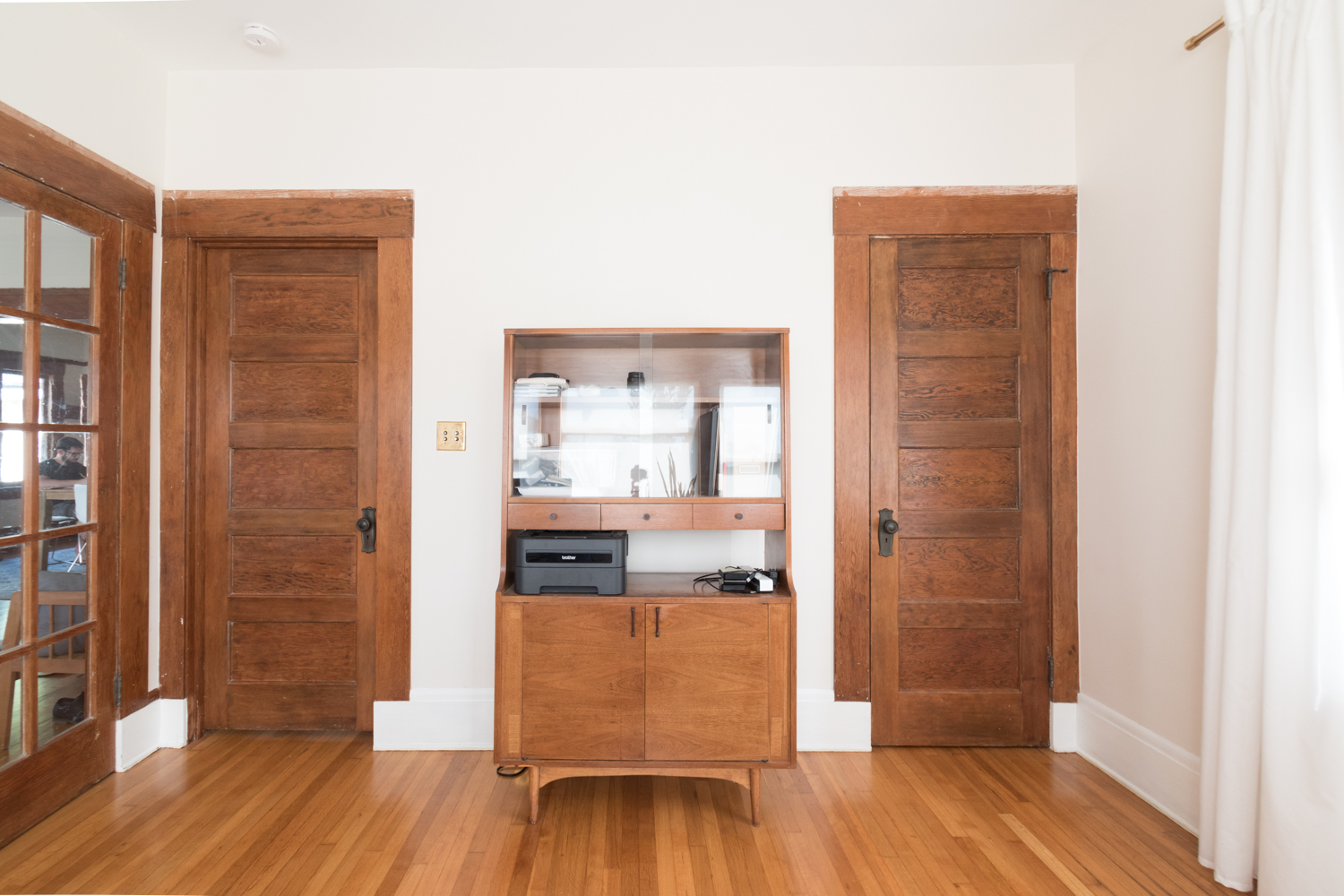
The hutch was a great estate sale find but it doesn't help with our storage needs. It has glass shelving for displaying pretties - which none of our office things are. It lacks drawers for files, so we have a little filing cabinet under the desk. Yet, neither of these combined units fit the bill for an efficient office. Problem 3: storage.
I painted the walls the same color as the living and dining room (Sail Cloth by Behr) then never decorated. There's no art, no pattern, no interest. Problem 4: boring aesthetics.
Luckily, I have a plan for the bland room and I can't wait to get started! This space is in for one heck-of-a-transformation. I hope you'll follow along and encourage me when my arm goes numb from hand painting that mural!
If you're tuning in via the One Room Challenge and want to stay up to date on the progress of this project and see what I have coming in the future, subscribe to get blog posts in your email! Also, follow along on Instagram where I'll share stories of the transformation along the way.
Be sure to check out the featured design participants here and fellow guest participants here, too!
Fall One Room Challenge progress:
Week 1 - the before, the inspiration, and the plan
Week 2 - preparing for a bold wall mural
Week 3 - tricks for creating a perfect wall mural
Week 4 - painting the mural
Week 5 - walls, windows, and shades
Week 6 - IKEA storage hack
Week 7 - the reveal!
Look back at the Spring One Room Challenge:
Week 1 - the before, the inspiration, and the plan
Week 2 - paint, paint, paint
Week 3 - how to install picture rail molding
Week 4 - sourcing the artwork
Week 5 - refreshing a chair
Week 6 - the reveal!


