Inspiration for a Simple, Humble, Utilitarian, Lived-in, Historic, Homestead Kitchen
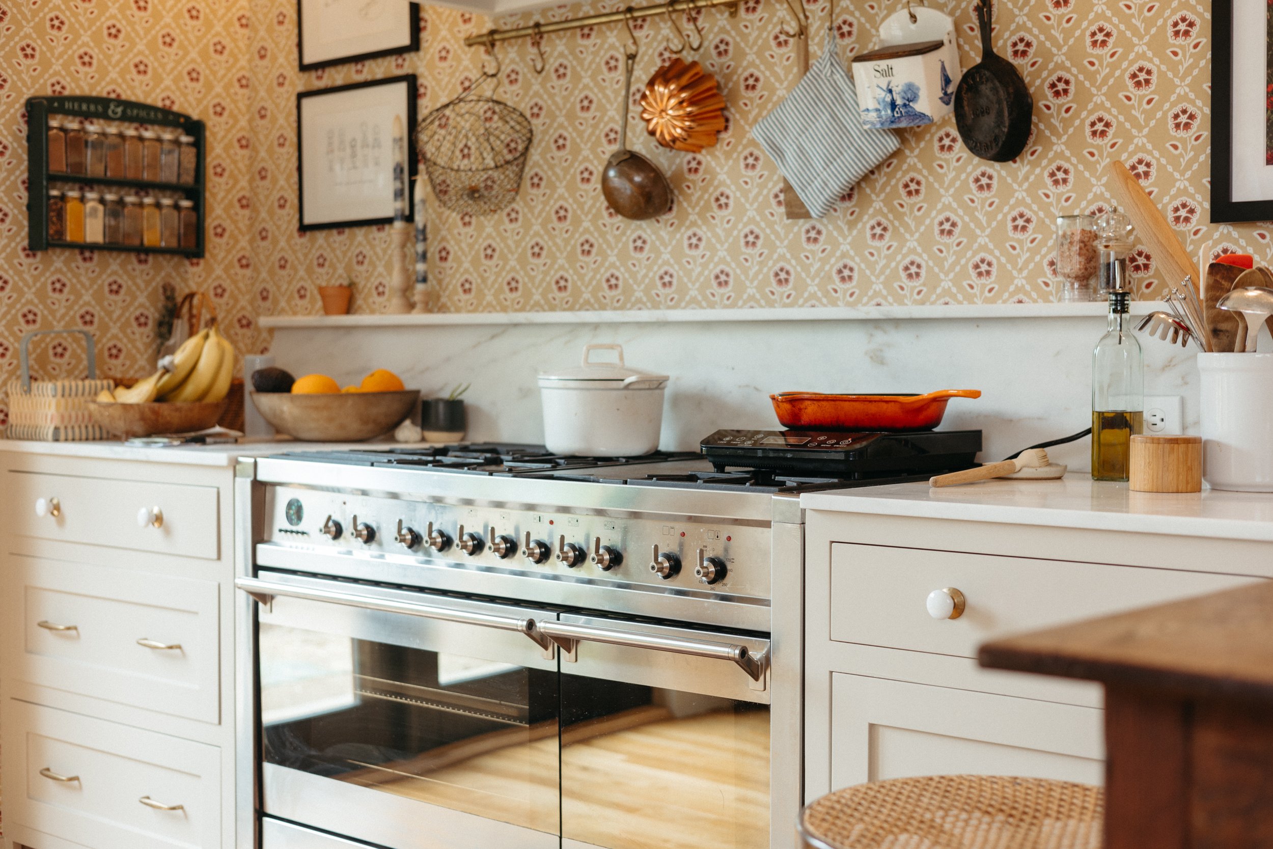
/We’re getting to the kitchen designing stage folks and it’s getting good! Before deciding on colors, door styles, hardware, and accessories, I want to nail down the mood/vibe of the space. I think it helps to identify a clear personality for the room - especially when it’s a utilitarian space. Hear me out.
Sources: The Marson House // Plain English // Beat Heuman // Hendrickson Churchill // DeVol Kitchens
A really good example of defining a personality for a room is when Cathy described what she wanted the Dexter House kitchen to be like:
“...Basically, I want the Dexter kitchen to feel like the kitchen of a 50-year-old Italian/Spanish/French mother of six, where you roll out biscuits right on the countertop, stir boiling pots of homemade marinara with your kids (your great grandmother’s recipe, obviously), and wear a cotton apron all day long. Or perhaps an efficient, newer version of that. Do you feel me?”
I love this sentiment. She’s not just designing what colors work well together, but rather she’s designing how the space will feel when it’s lived in. She’s designing it for being a utilitarian space rather than just a showroom. The imaginary character she made up will help dictate the color palette and finishings. And, I think she nailed the vibe in the final reveal of the kitchen, too.
Now, I’m not all that well planned out and I’m too indecisive to craft a defined character for my kitchen, but I can say for sure that I have some pretty clear ideas for the overall function and design of the space.
The main words I think to use for the design are simple, humble, lived-in, and utilitarin. I’ve been pinning kitchens that fit this aesthetic to a Pinterest board here:
I have ooooodles of kitchens saved there, so I encourage you to scroll through the widget above or click through here to admire them all. I simply can’t put all of them into one blog post!
What I like about these and why I call them “simple and humble” is that they don’t feel too precious or fussy. They aren’t overly poised or pretentious - rather they’re inviting and welcoming, yet clean and refined.
This board has my general aesthetic with clean and modern elements combined with some eclectic designs. I’ll break down the variety below.
I really like the “deconstructed kitchen” or “unkitchen” design. This vibe feels lived-in, homey, eclectic, and warm. Instead of a solid bank of cabinets, work surfaces are a mix of antique tables and rolling carts. There are stand-alone appliances. There are antique plate racks for storing dishes on the wall. There’s mismatched lighting. There’s antique linens and salvaged lumber.
What I particularly like is the spaces feel very utilitarian. The cookware is handy and accessible. Herbs are hanging to dry. Countertops have rising sourdough and fermenting pickles on the surface. There are very few things in them that don’t belong. Anything on an open shelf is for using rather than simply displaying.
Admittedly, some of these designs are too rustic for us. Ross likes clean lines and solid surfaces. I like a bit more simple and pared-down workspaces. But these rooms are inspirational nonetheless!
The other inspiration is what I refer to as a “homestead kitchen” which doesn’t look wildly dissimilar from the deconstructed kitchen. The idea here is that the kitchen really is a workhorse and is set up to accommodate making things from scratch.
Instead of a pantry to store bulk snack bags, it stores preserved items in jars. Instead of open shelves with pretty decor, it has stacked banneton baskets for rising bread. Rather than bulk potato bags, I’d have a basket of root veggies. I want to have a spot for my kombucha to ferment, a spot to grow mushrooms, and a dedicated place for my grain mill.
The way we plan on cooking and using the kitchen is definitely influencing the way we want it to look and function. Now, I’m not a full-on homesteader (yet?) so this is something I’m going to grow into, but I sure to like dreaming of a kitchen full of preserved veggies from my (future) urban garden.
And then there are antique kitchens! I talked a lot about kitchen design from 1915 in this blog post, so check that out for more info. I elaborate on kitchen function, values, materials, layouts, lighting, storage, and all the things. It’s one of my favorite blog posts, so I encourage you to check it out. I won’t repeat it all here!
Lastly, I want the kitchen to be an extension of us and our home. I don’t want to pretend that my house is full of antiques and homesteading tools like the inspiration images. I’m still a modern lady that likes modern elements, technology, and contemporary ideas.
So, I want artwork in the kitchen that feels like us. Prints or photographs that are funny, edgy, pretty, and weird are my cup of tea. But I also dig a vintage landscape. We’ll see what happens!
Are you getting the gist? I want a kitchen that:
is a space for efficiently working in
isn’t too precious that we’re afraid to use it
is homey and inviting
isn’t a pretentious show-home
is a space for a family of varied ages
isn’t too flashy and is truly approachable
feels like us
combines modern amenities with historic charm
is designed to be functional foremost, but also pretty
will patina and age with time rather than look shiny and new forever
blends styles and periods for a timeless look
I’ll admit that I don’t know how good I’ll be at executing my vision. As much as I like those unkitchens, the type A in me will want a perfectly clear countertop that isn’t cluttered. As much as I like color and dramatic artwork, I have a hard time committing to just the right pieces. As much as I want to have a cabinet of picked veggies, I’m not currently growing anything in my garden.
Maybe I’ll create the perfect combination of all of my inspiration. Maybe I’ll miss the mark and it will be a weird collection of mismatched things. Maybe I’ll chicken out and be more restrained and average. We shall see!


