Inspiration for a Simple, Humble, Utilitarian, Lived-in, Historic, Homestead Kitchen

Inspiration for a Simple, Humble, Utilitarian, Lived-in, Historic, Homestead Kitchen

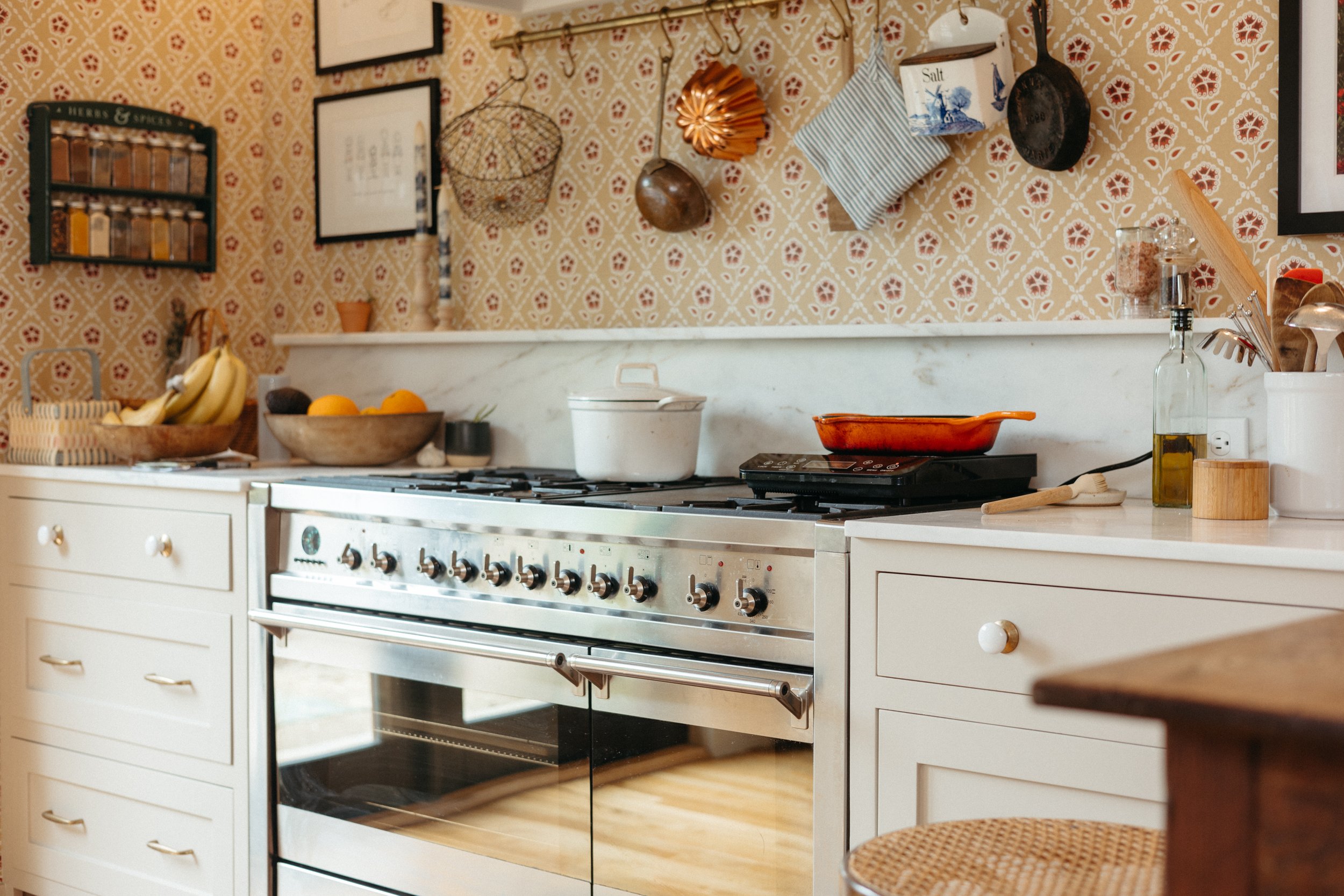
We’re getting to the kitchen designing stage folks and it’s getting good! Before deciding on colors, door styles, hardware, and accessories, I want to nail down the mood/vibe of the space. I think it helps to identify a clear personality for the room - especially when it’s a utilitarian space. Hear me out.

Read More

10 Things to Do With Scrap Christmas Greenery

10 Things to Do With Scrap Christmas Greenery

‘Tis the season for covering our houses in Christmas greenery (if you celebrate - or if like me, you just love greens). There are so many things that can be done with the small cuttings off those pine trees or boughs from the garland. So, if you have spare scraps, read ahead. Or, if you’re late to the decorating game, on a tight budget, or living in a small space, here are some ways to bring the greenery in without the fuss.

Read More

Trash Pumpkin: Making Seasonal Decor Out of Literal Garbage

Trash Pumpkin: Making Seasonal Decor Out of Literal Garbage

I’ve never been too big on decorating for the holidays. Sometimes I’m into it, but I mostly get tired of the tchotchkes and want my home to be clutter-free again. Partly I don’t like the look, but I also just don’t like buying decor that’s cheap and will ultimately end up in the trash. BUT! Enter trash pumpkin. The decor that literally takes rubbish out of the bin and keeps it out of the waste stream.

Read More

Gift Guide for Entertainers

Gift Guide for Entertainers

I tend not to entertain as much as I’d like to - I prefer to sit at home by myself in my PJs, I suppose. But, since I’d like to host more, I rounded up a few items that would make entertaining more fun. I think all of them would be well appreciated by the person that’s always inviting you over.

Psst! Everything is plastic free, btw.

Read More

Super Subtle Halloween Decor with Items from Around the House

Super Subtle Halloween Decor with Items from Around the House

I don’t go big for many holidays, but I do like that Halloween is an excuse to gravitate towards dark hues and eerie decor. I don’t do inflatable skeletons, glittery pumpkins, cartoony ghoulish figurines, nor over-the-top gore scenes. I like a classic and simple halloween look that’s really just an extension of my every-day style. This year, I didn’t want to buy anything, so I made a few spooky scenes with 99% decor I already have and use on the daily, and 2% last year’s halloween decor.

Read More

Halloween Inspired Vintage Art

Halloween Print in Bathroom The Gold Hive

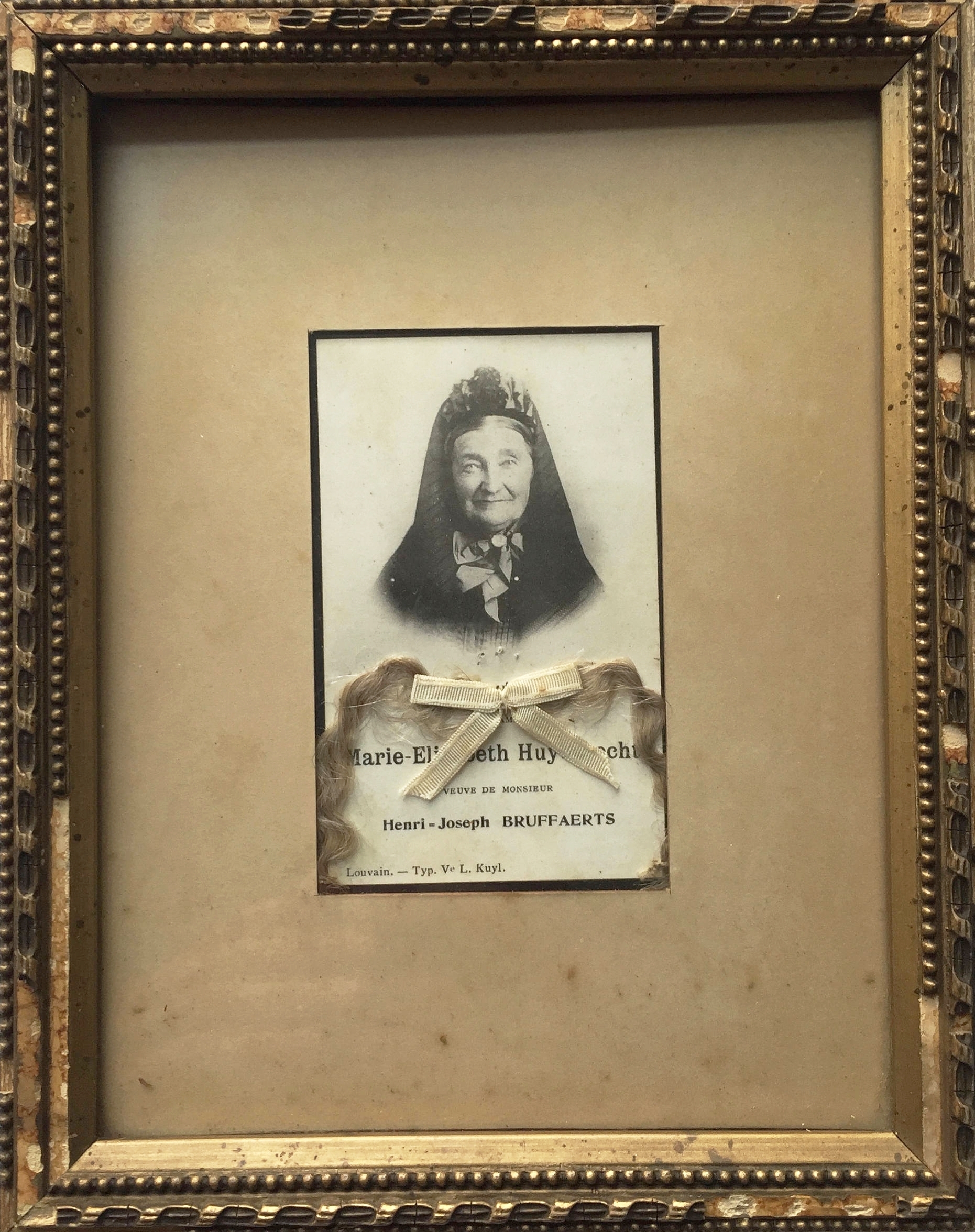
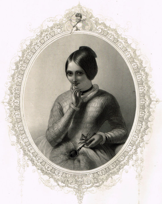
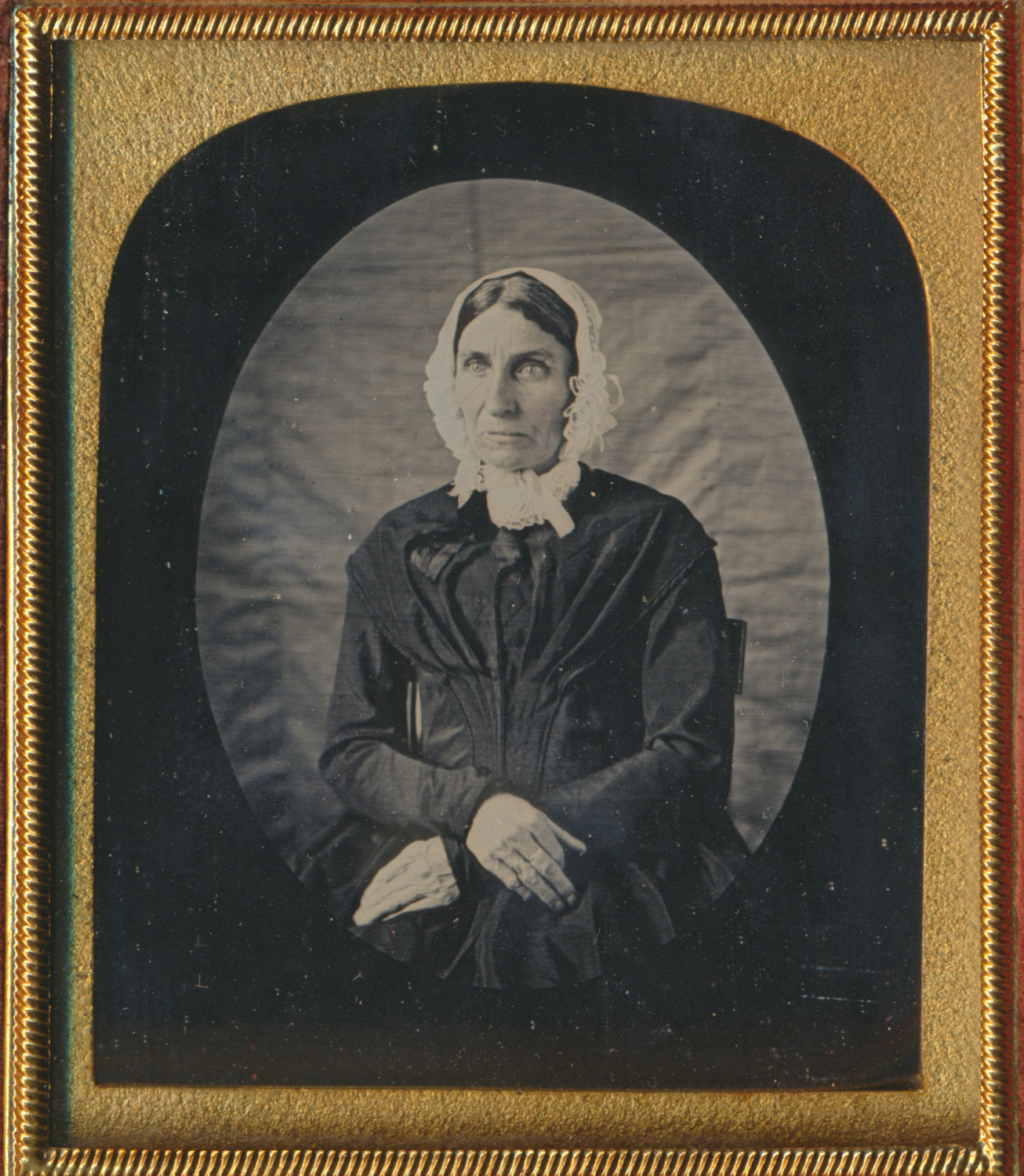
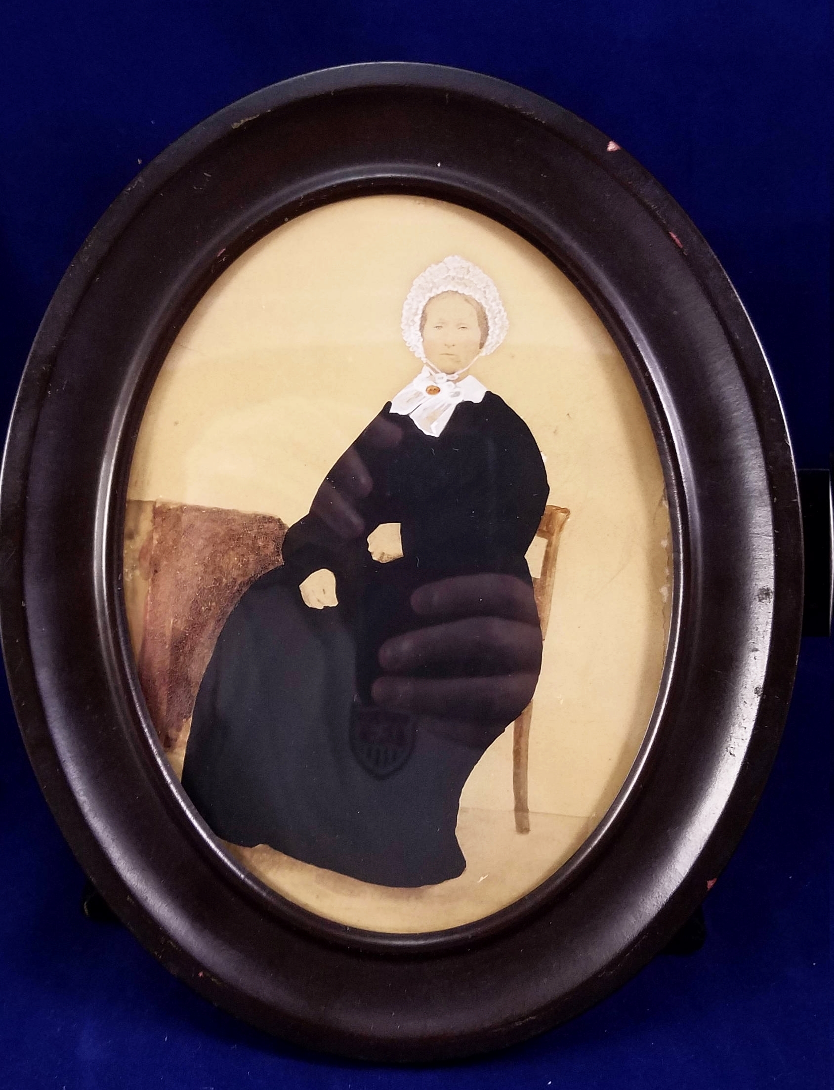
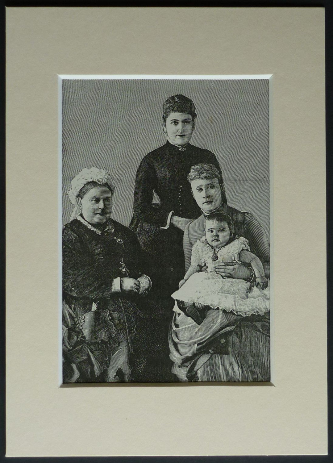
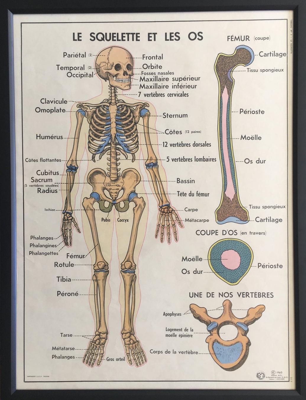
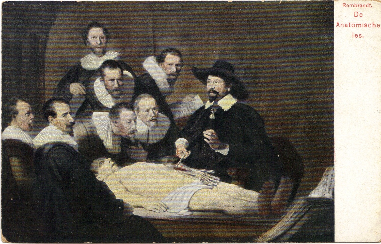
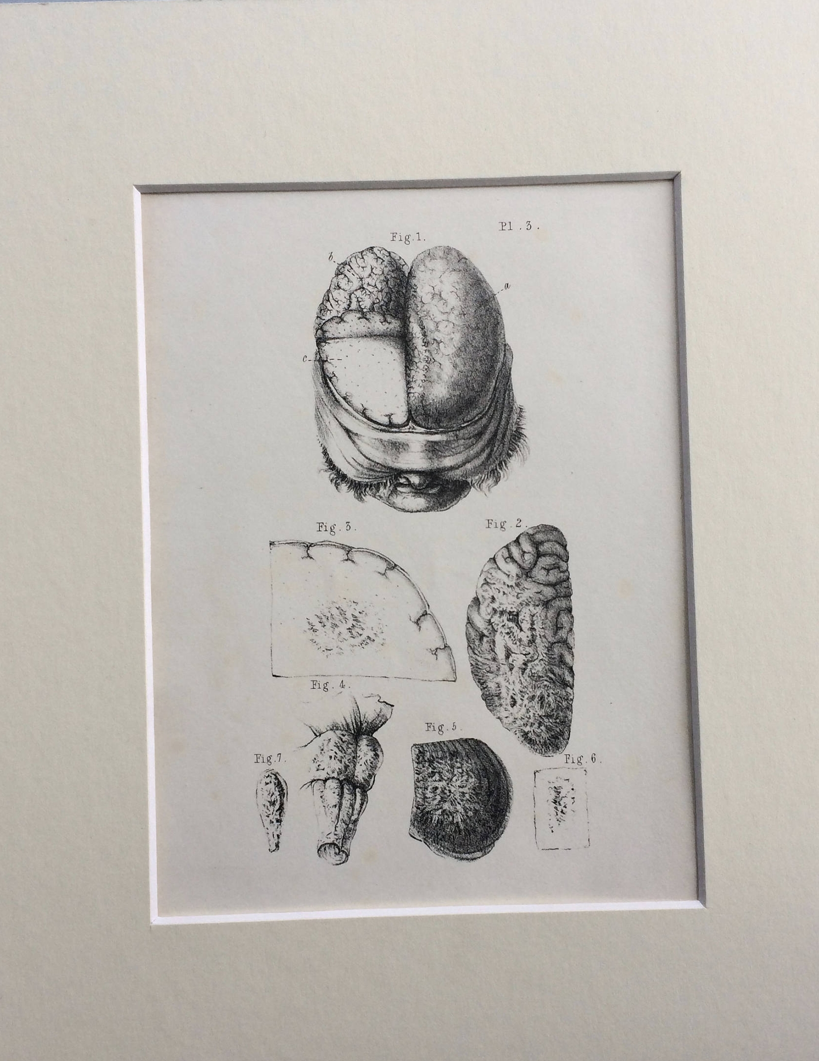
I don't like to go wild with decorating my home for the seasons, but I love that Halloween gives me an excuse to display eerie, weird, dark, melancholic, spooky, mischievous, and creepy artwork. I've collected some of my favorite vintage art from Etsy that could be great all year long but has a particularly spooky vibe during the month of October - especially en masse. All of these are available for purchase and should make it to your home in time for All Hallow's Eve. Enjoy!

Portraits

How do you like that bearded man's side eye? And that girl's mischievous look? Pretty much any daguerreotype is perfect for Halloween decor by the nature of it.

Flora/Fauna

Sorry to any of you that don't like creepy crawlies. Can I interest you in some bones?

Anatomy

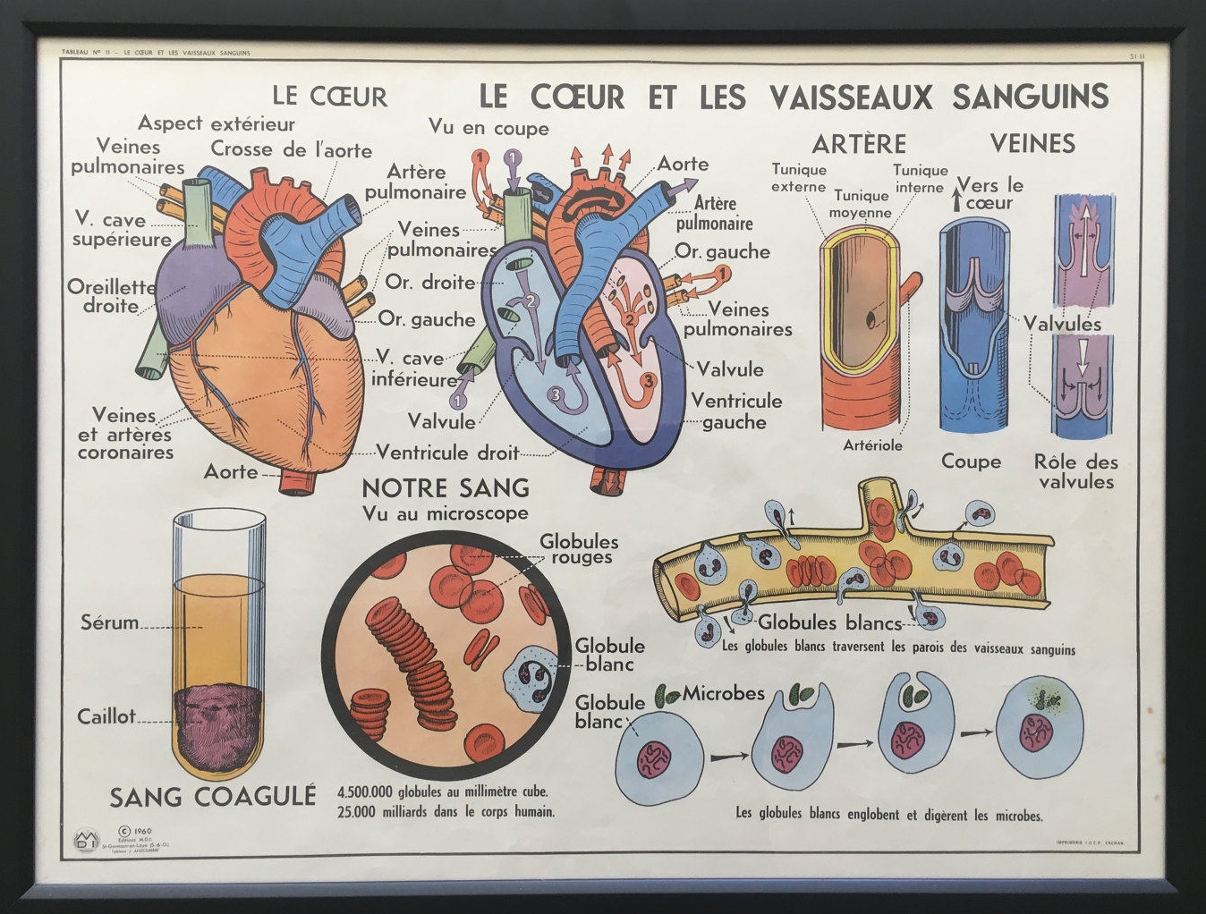
Those retro anatomy prints are so cool. They are available on Etsy, but are also sold in an awesome brick & mortar shop in Joshua Tree. It's a must stop if you're in the Palm Springs area!

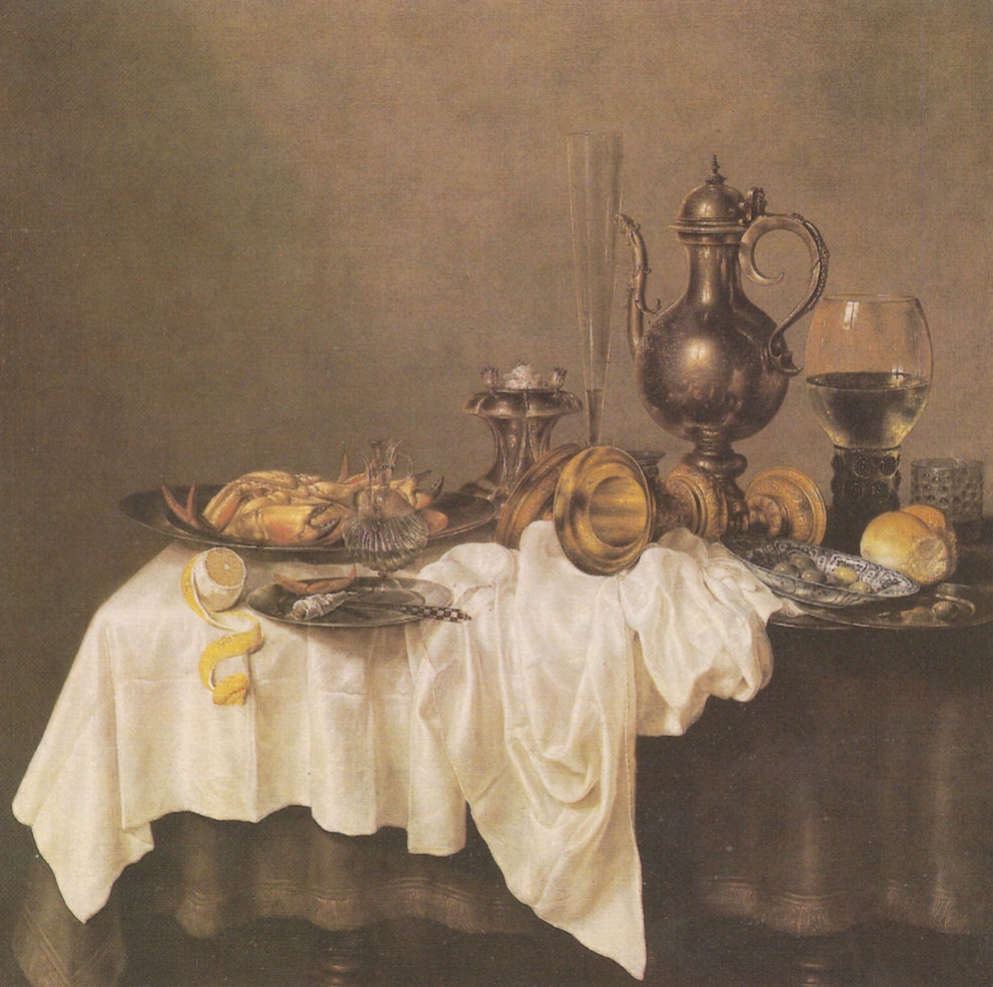
Still Lifes

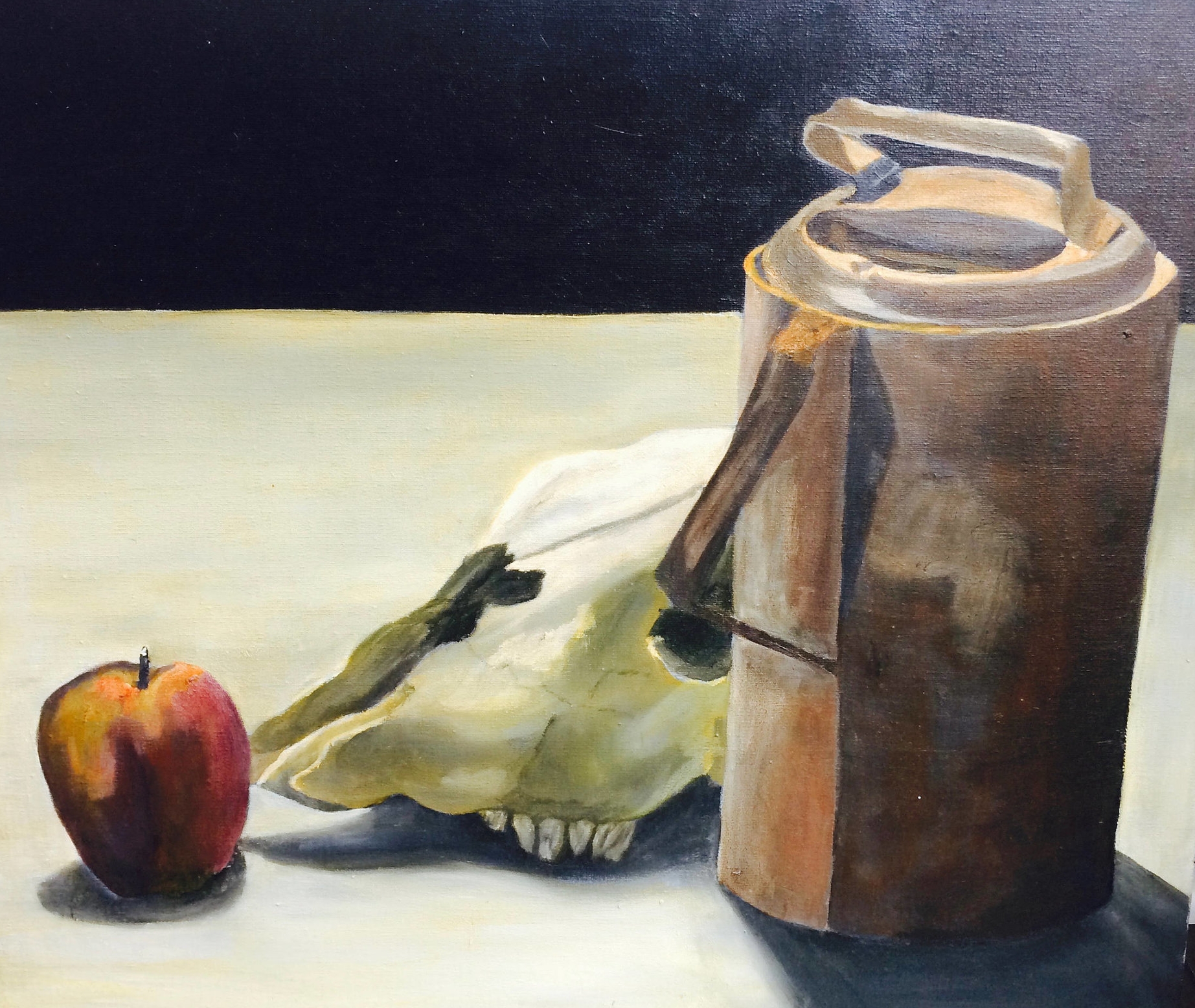
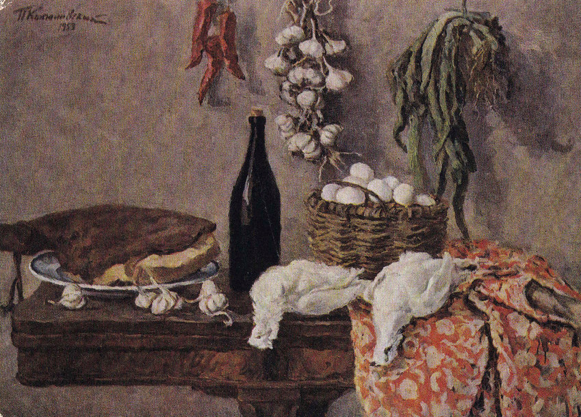
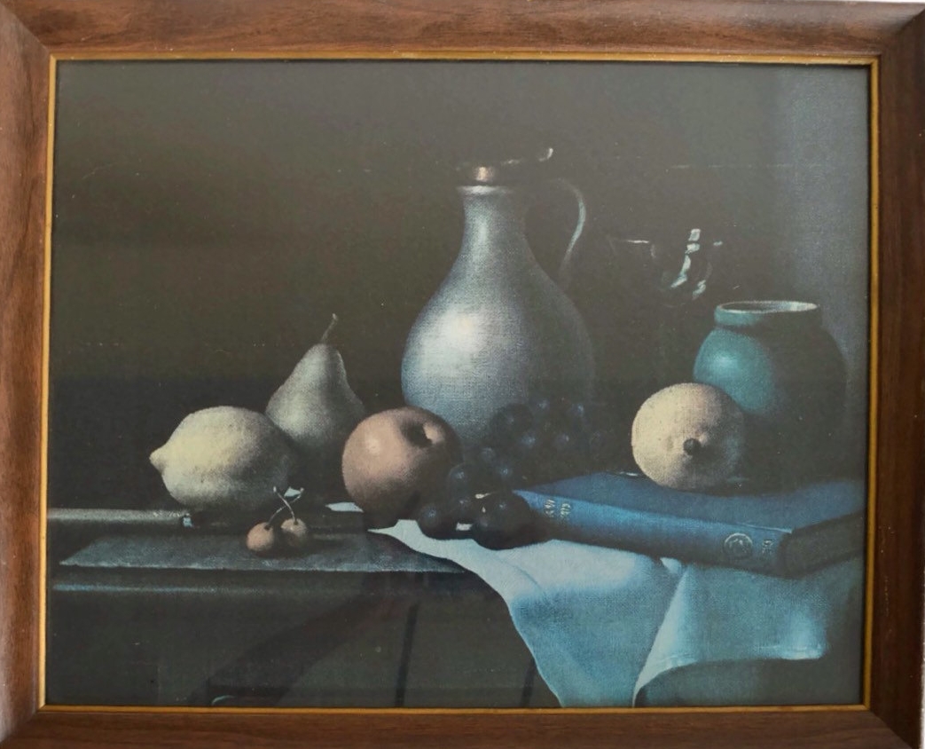
These still lifes are anything but lively.

Landscapes

I genuinely find cemeteries to be beautiful. Anyone else with me?

Happy (almost) Halloween!

Finally Deciding on Living Room Chairs

I had been struggling for two years to find the right living room chairs. I put hours into testing seats, photoshopping mock-ups, and browsing styles online, and I even tried a few in the room before returning them. I was dealing with clashing elements in the space that kept dictating what kinds of chairs would be a good fit.

How to pick living room chairs

This post is in partnership with Article!

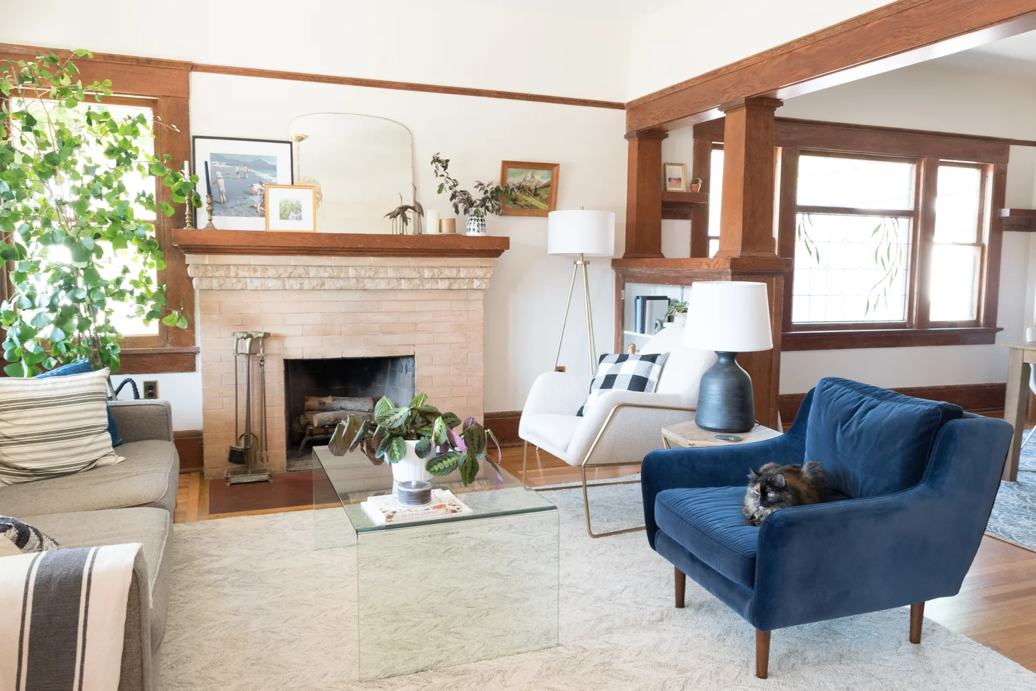
The blue velvet couch that now lives in the den was previously in the living room. The bright color, the velvet fabric, and the tufting steered me away from any other seating that had those elements. I just didn't want a room full of tufted upholstery or oodles of color. The living room's woodwork has orange tones that kept me from any of the camel colored hues or natural wood hues. Even though I wanted a chair like this, it simply would have been too much.

Living Room Before

We lived with that super clashy teal chair and the wooden dining chair for a couple of years while I hunted for the right ones. These two were leftovers from our old house and they were probably the worst chairs for the space - oy.

I was on the lookout for neutral colors, with simple lines, that were neither bold nor boring. It was a tricky thing to do! I was looking at traditional designs, modern wingbacks, casual cushionsswiveling bases, and so so so many more.

But then, the blue couch and the existing teal chair moved to the den when I transformed that space for the One Room Challenge earlier this year. And my world opened up! I moved the grey sofa into the living room and it instantly neutralized the space. I still plan to replace it with another piece without tufting and a lighter color, but I'm happy to have it for now as it lets the chairs be the center of attention rather than the big couch.

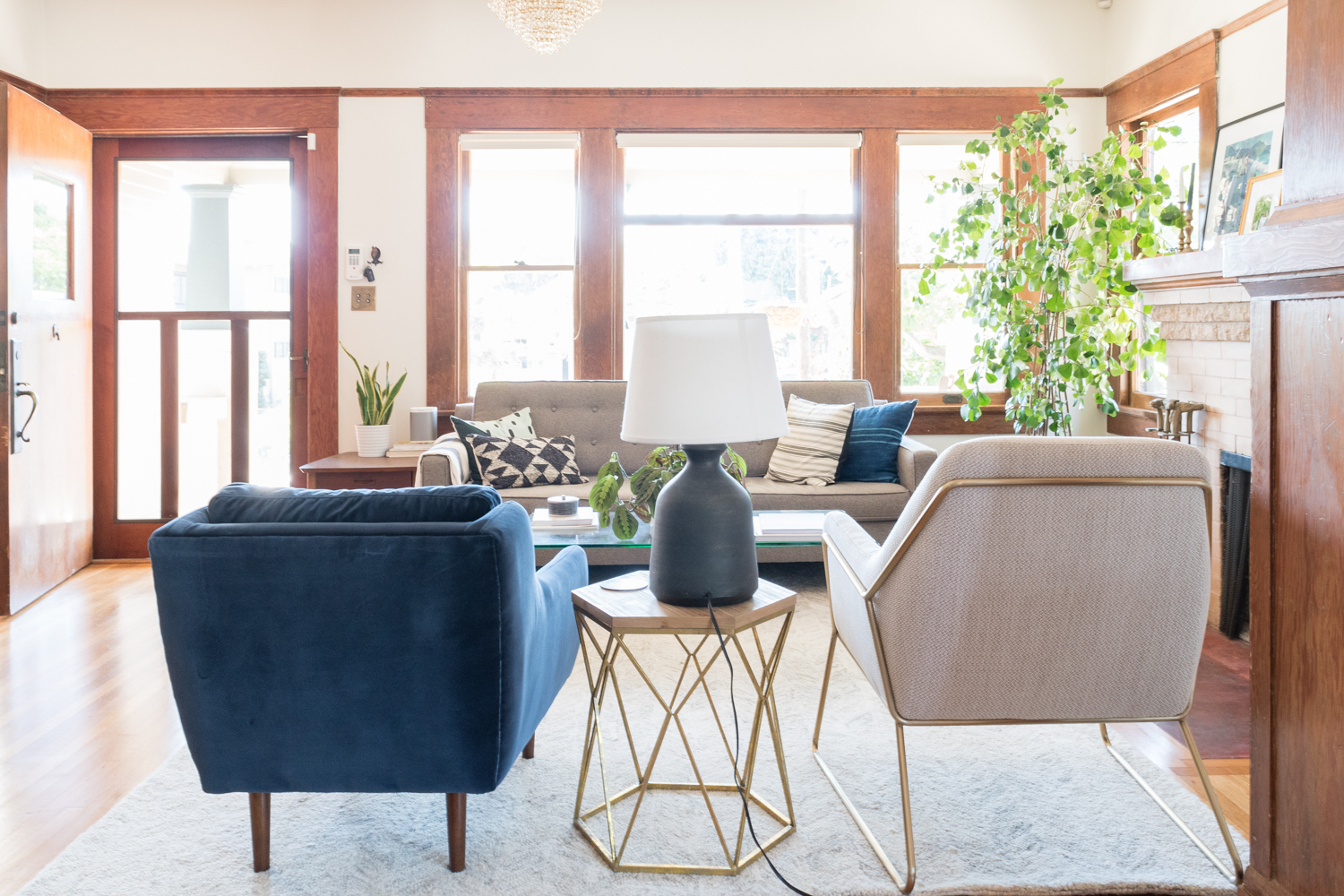
Through the swapping of furniture, I learned that I prefer a simple couch to ground the space, with accent chairs to add the personality. I also came to the realization that I wanted to find ways to make the living room feel more casual. The traditional woodwork, my affinity for velvet (more on that later), and the fact that the space is free of a TV, makes the room feel quite formal. An easy way to make a space feel less formal is to not go super matchy matchy. Some may disagree, but I decided I'd get two accent chairs that didn't match. 

So, I started my search over from scratch and this time I could source pieces that had color, texture, tufting, and leg designs that would complement a future couch. I could also pick two favorites instead of narrowing it down to one!

I'll quit my ramblings and just show you which beauties I picked out from one of my favorite online retailers, Article.

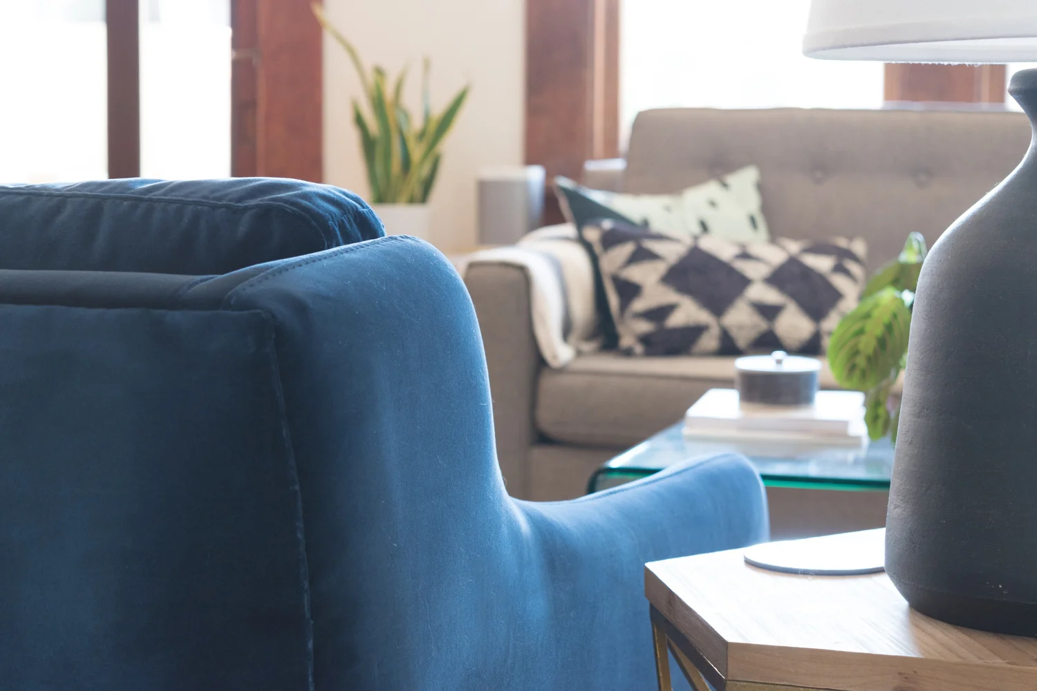
Blue velvet living room chair

Aren't they the bee's knees? 

Blue velvet Matrix chair from Article

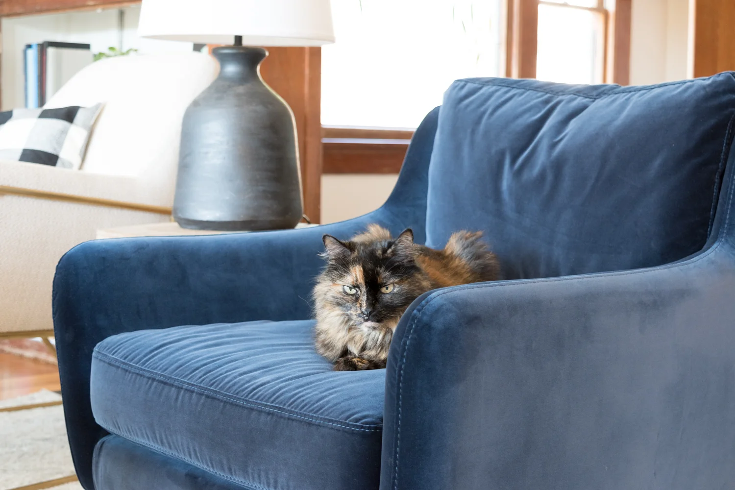
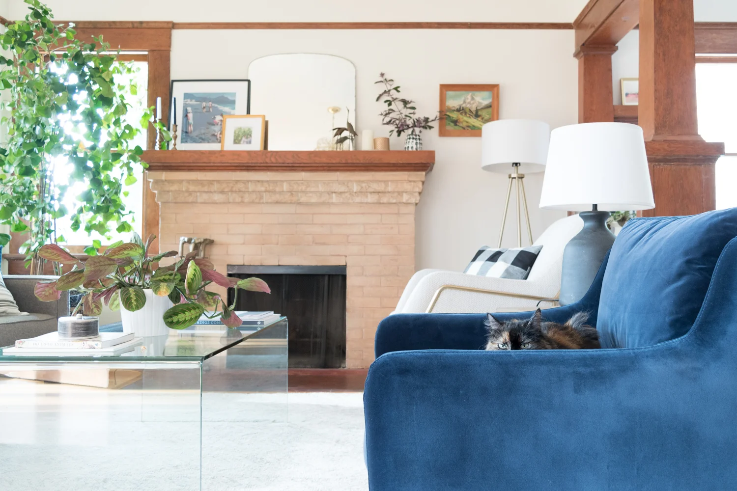
Surprise surprise, I got another blue velvet piece! I just love the texture, and so does the cat! We've learned that velvet is the best material for avoiding cat scratches. Mabel does her fair share of scratching on rugs and furniture around the house (and I follow right behind her with a spray bottle attempting to dissuade the behavior). It's super frustrating and I've tried all the tricks to get her to stop, but velvet is by far the best material for holding up to the cat's natural tendencies.

That texture is simply irresistible to me and the cat. She spends HOURS lounging on this chair, it's her new favorite spot.

Blue velvet Matrix Article chair

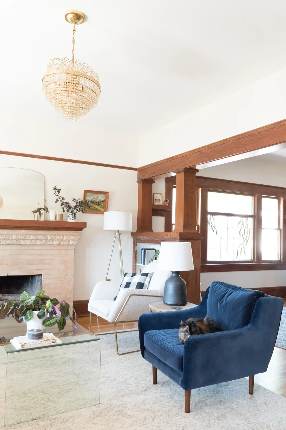
I fell for the Matrix's color and fabric, but its scale fits the room just as nicely. In my heart of hearts I wanted a big wingback that I could curl up in while wearing a smoking jacket and plaid house shoes as I peruse my collection of leather bound books that are so aplenty that they are only accessible from a library ladder. But, literally none of that applies to my daily life, so I'll have to save that scenario for my dreams. This real life room needed something smaller scale to maintain sight lines to the adjoining dining room, and narrow enough that the walkway wasn't blocked. Matrix is a perfect fit with its compact size.
Forma chair from Article

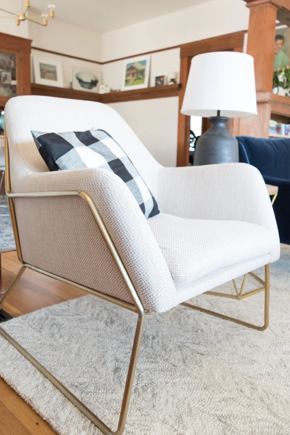
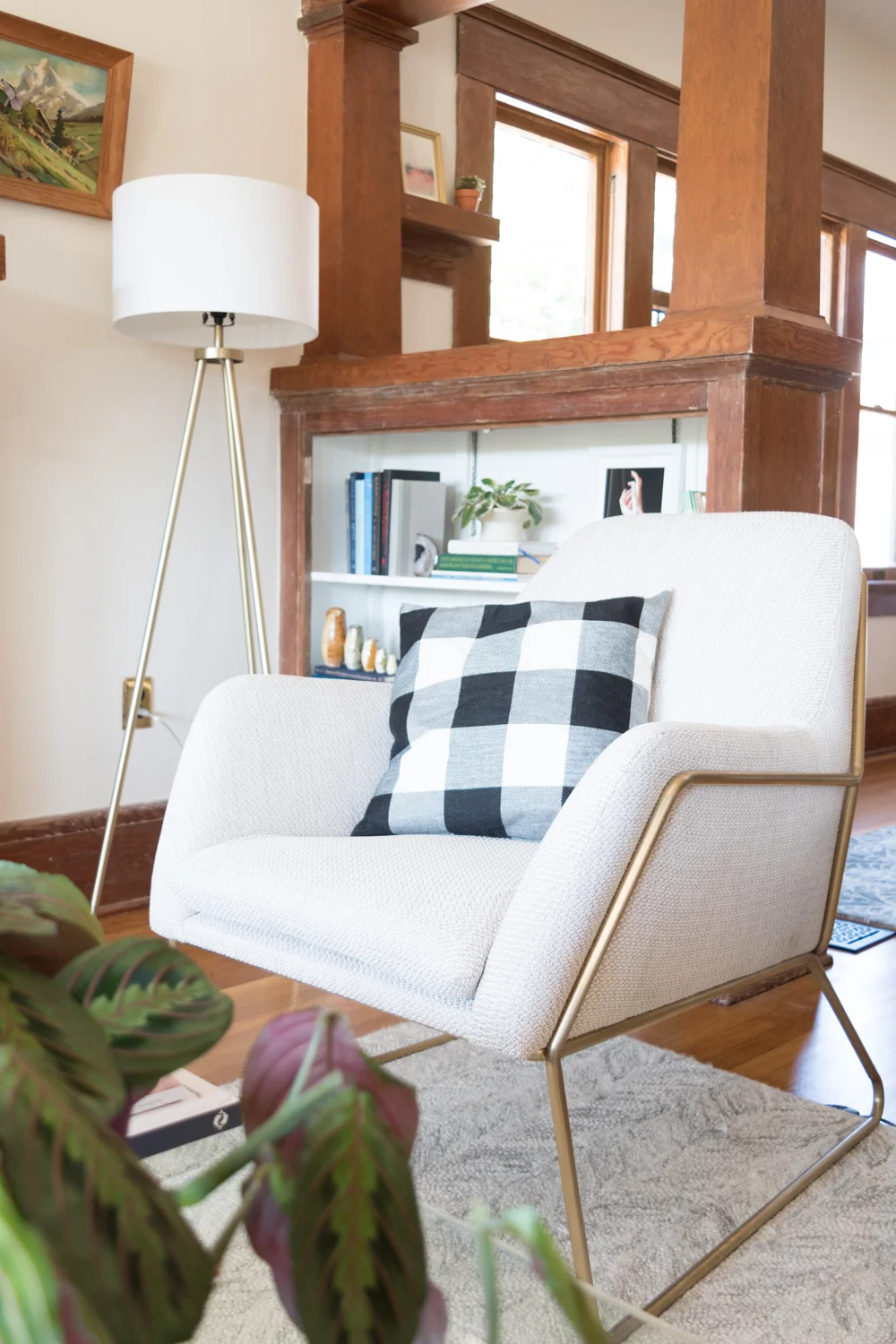
Now the Forma chair. What a beaut! The fabric texture adds just the right amount of detail without distracting from the pretty shape. With all of the chunky woodwork in the room, I wanted something that had soft curves and sleek legs that added visual lightness and this chair fit the bill.
Forma Article living room chair with gold detail

Check out the back detail! Since the chairs float between two rooms, the backsides are just as important.

How to pick chairs for living room

Ordering chairs online can be worrisome if you don't have the chance to try them out beforehand. Our home's chair critic (Ross) was wary, but he absolutely adores the comfort factor. He's the kind of seating judge that if he says "it's fine" then you're winning. It's a multi-layered evaluation that I don't fully understand myself. But after I found him quietly sitting in the Forma chair for ten minutes, I asked his opinion and without skipping a beat he said, "I love it." Victory! He had the same feelings about Matrix, but he had to wait until the cat got out of that seat before he could indulge.

Styling living room chairs

It's so great to walk into the house with these chairs on the welcoming committee. Now, I need to get a new side table and a new couch to really let these beauties shine.

Be sure to check out the other beautiful chairs from Article, including this perfect caramel wingback, and this one that looks great in blue velvet, too. They also carry lots of other modern furniture pieces, all for a flat shipping fee of $49. Plus, the Article team is just so darn nice!

I wasn't kidding when I said that Mabel loves the Matrix chair. I tried to remove her for the sake of these photos, but she kept jumping back into her spot.

blue velvet living room chair

Tell me, am I pushing it with the blue velvet furniture in my house? Would you do non-matching chairs? Which cat scratching remedies are effective for you? Who is the biggest chair critic in your family? Which Article chairs do you fancy? Share away!

My Number One Tip To Style A Bookshelf

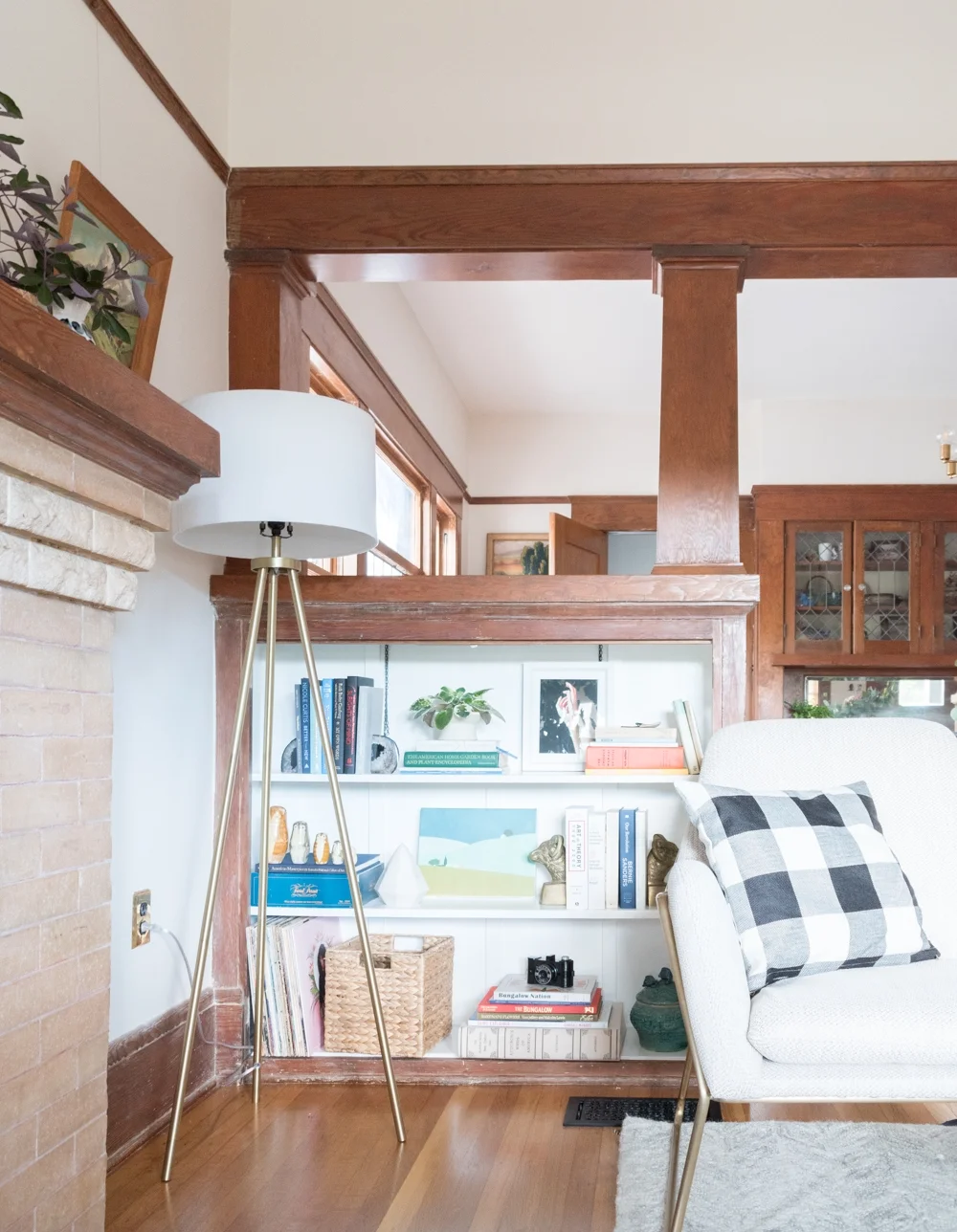
I don't believe that there are rules for styling shelves. It's such a unique and personal way of showing off your collection, that preaching my rules feels just plain wrong. I will, however, share my number one tip!

The Gold Hive Shelf Styling

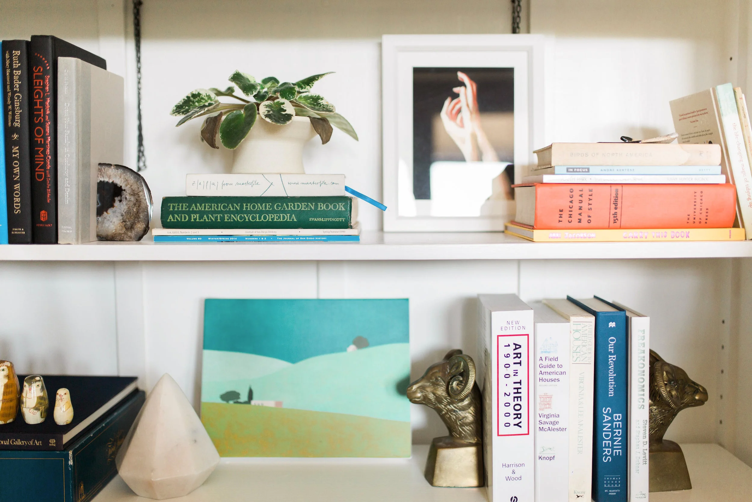
One of the best ways to dress up, or rather, dress down your books is to remove their dust jackets. The floppy papers wrapped around the covers have lots of color/style variety, so removing them can strip the book down to its simplest form. The book's actual spine is traditionally one color, with an understated typeface. It's so much more of a classic style that keeps your bookcase looking more intentional, and I actually find it easier to locate my favorite reads. 

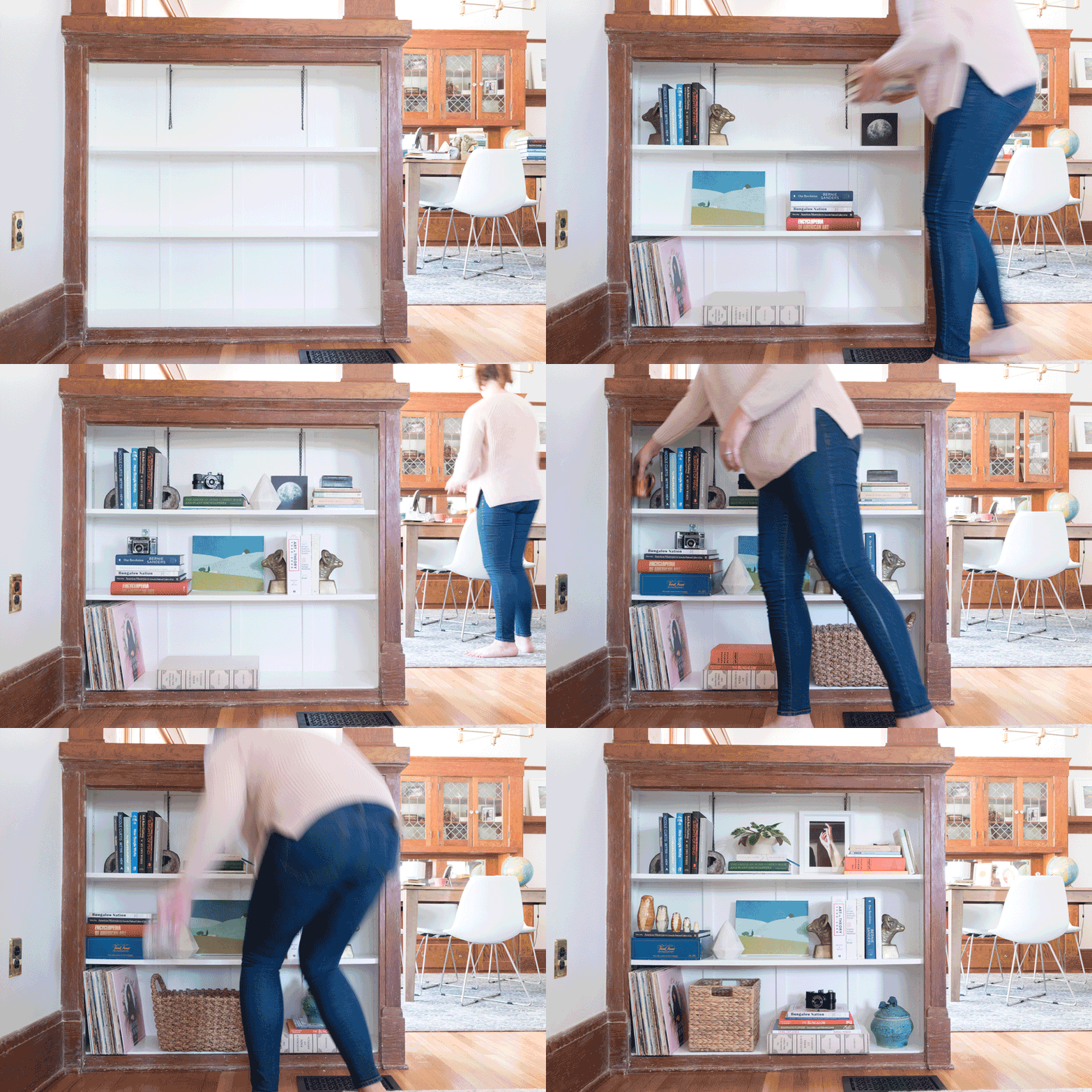
Everyone loves an animated gif, so I put one together to show off how much of a difference removing the dust jacket makes. (If you're reading this in an RSS reader, click through to the original post to see the animation.)

The Gold Hive Dust Jacket

If you're less of a gif animation person and more of a spot-the-different person, well, here you go:

The Gold Hive Tip to Style Shelves

Did you see the Audubon book without its jacket?? So. Pretty.

Once I stripped the books of their jackets, I collected things that I love from around my home and moved them around on the shelves until it felt right.

The Gold Hive Styling A Bookshelf

That timelapse (if you're in an RSS reader, you may have missed it and you should click here to see it) was my whole entire process. You can see I changed my mind several times, and kept tweaking over and over. My approach is more organic and less crafted than profesh designers might do.

As I made changes, I kept an eye on color, texture, height, and objects - aiming to vary them throughout the bookcase. It isn't perfect, and I'm still continuing to tweak things.

The Gold Hive Styling a Bookshelf

If you want to get serious about styling your shelves, you could keep everything to a uniform color palette, turn less-pretty spines to the back, or use more sculptural items to match a theme. However, I like books for being books. I'm generally not a fan of the shelves that organize the spines by color.

I also like to style my home with things that I find to be unique or heirloom-y. I'll supplement with knick knacks from Home Goods, but what I love about this shelf most is the vintage camera, the handmade pottery, the books we like to read, the record from a recent concert, the old-school Trivial Pursuit game, and the artwork that I'm drawn to.

But really, you do you. Go for the monochromatic scheme, the packed-to-the-gills library, the minimal look, or the filled-with-tchotchkes collection. I encourage you to make it feel like a representation of you and your home!

Looking to add more to your shelves? Below are a few of the items on our bookshelf. But we'd like to add more, what are your book recommendations??

Oh, and that very first photo was taken by my friend Dani for an exciting project coming up. (!!!)