Trying To Figure Out A Nursery Plan
/I announced that we’re having a baby three months ago, so you’d think that as a home blogger I’d be sharing all about the design process. But I haven’t been, have I? Well, it’s because it’s been a slow design process and just not the highest priority for me. But I’m here to give you the scoop and also ask your thoughts on the matter.
A lot of the design has been up in the air, but a few things are known.
A human baby is moving in with us in 6ish weeks.
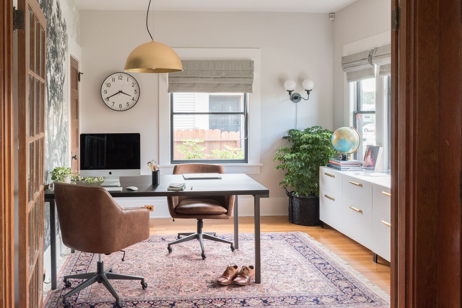
Her room will be what used to be the den which is conveniently located right next to our primary bedroom (and the laundry!)
We know that babies have a lot of stuff, but also they don’t need a perfectly finished room as soon as they’re born. We expect babe to be hanging out in our room for quite some time. And if she has to sleep in a cardboard box or a dresser drawer, that’s a-okay with us.
We can try to plan every little room detail as it relates to how we’ll care for baby. But we’re new to raising a small human, so we’re trying to stay flexible with the room layout and furnishings we’ll use.
I’m trying to take it easy and not put pressure on myself to design the perfect bedroom that will last baby for years. We know her needs and our needs will shift, so we’re trying not to over-plan for the future or for the temporary phases of infancy/toddlerhood/childhood. This is really challenging my type-a planning personality but I’m trying to absorb Ross’ calm demeanor as we plan a bedroom for someone we’ve never met.
All this being said, I’ve been running through all sorts of different designs for months now. And true to form, the layout is always the most important part for me and where I start all my design planning.
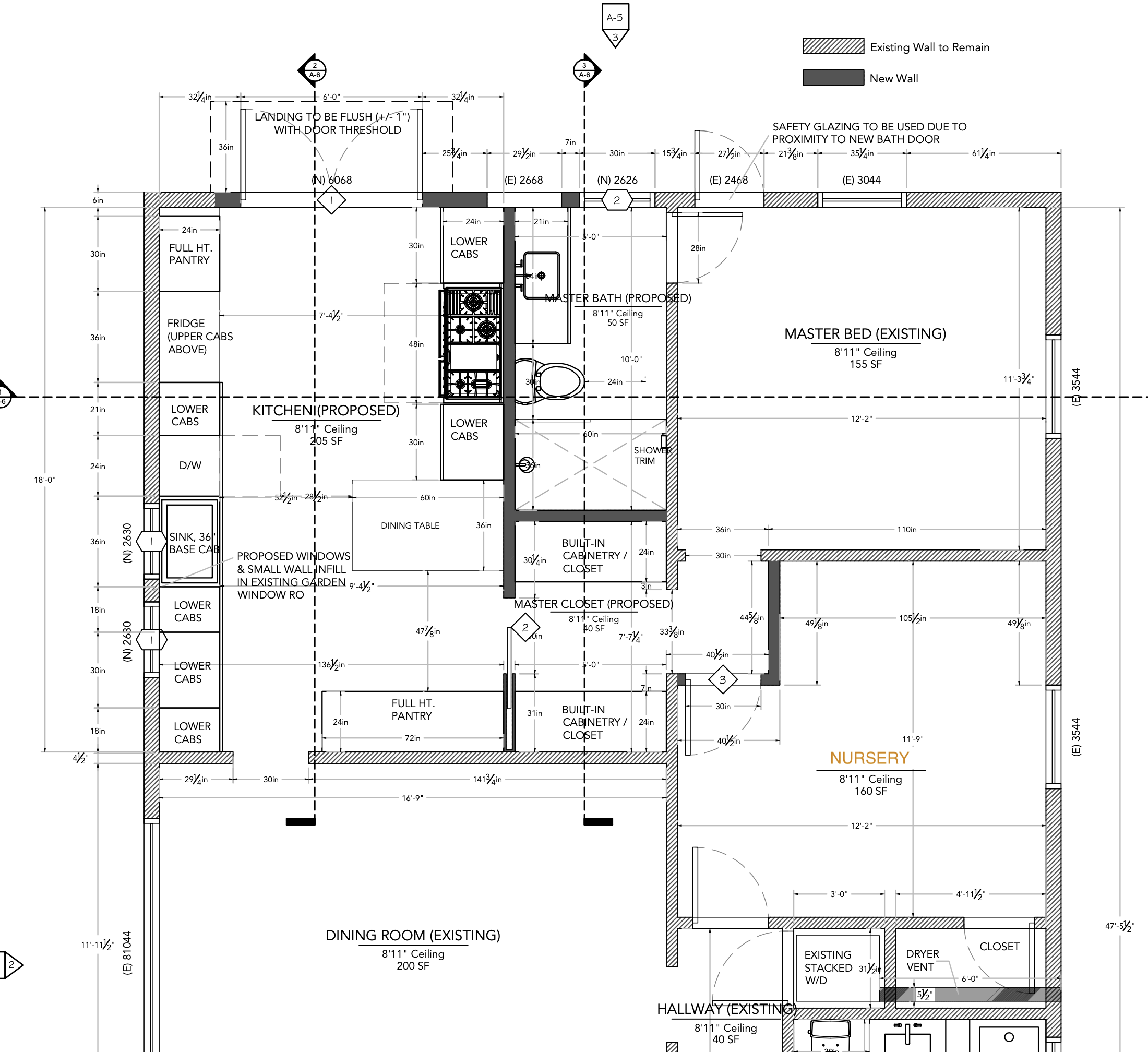
For a refresher on the den, it’s an 11’9” x 12’2” room that has a jack-and-jill style door situation with one doorway into the primary room and another on the opposite wall into the hallway. It also has a closet door, and one big window. You can get a layout understanding of the whole house in the video walkthrough here and with the floor plan noted below. You’ll also note that we added an additional mini-wall in the corner of the nursery to accommodate a new flow from the kitchen to the primary room during our big kitchen remodel.
All this to say, the room is a bit challenging to fit all the things we think we might want in there. Sure, there’s room for a crib, a changing table, and a rocking chair. But what about books, toys, a place for someone else to sit, an area for baby gear and stuff? What about a bed to lounge on and read books in?
With the addition of the small wall in the corner, we now have a cool recessed nook. It feels like the perfect spot to put a bed, doesn’t it?! I started to imagine a sweet comfy place to lounge as a little family full of pillows and books, just like in the room Nicole designed (below) and like the nursery I helped design for a friend.
Just look at how charming that little seating area is tucked between the walls! (You can see more photos here.) Since the den was our guest room, I started to think the bed was the perfect way to have a place for a guest to sleep in a pinch, a sweet place to cuddle with babe, a convenient spot for Ross and others to gather while babe and I are rocking in the glider, and it felt like the best use of the room’s layout. I was hooked!
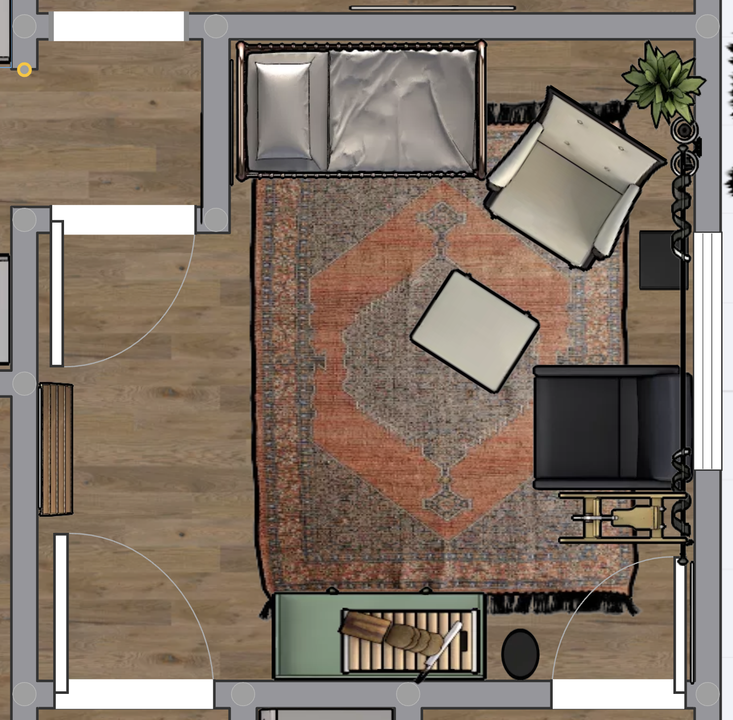
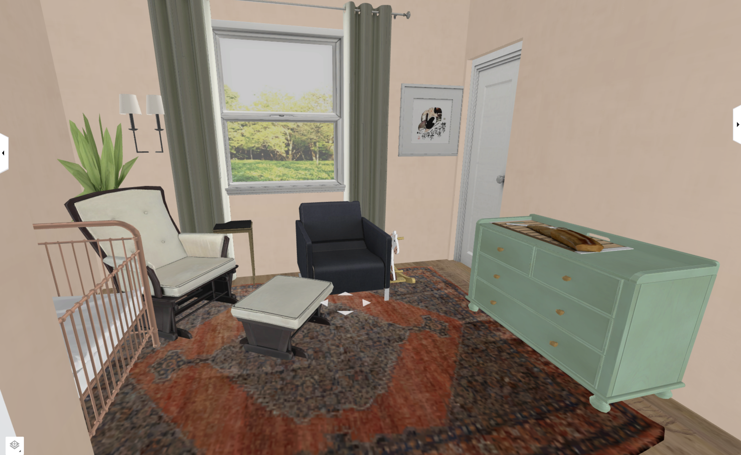
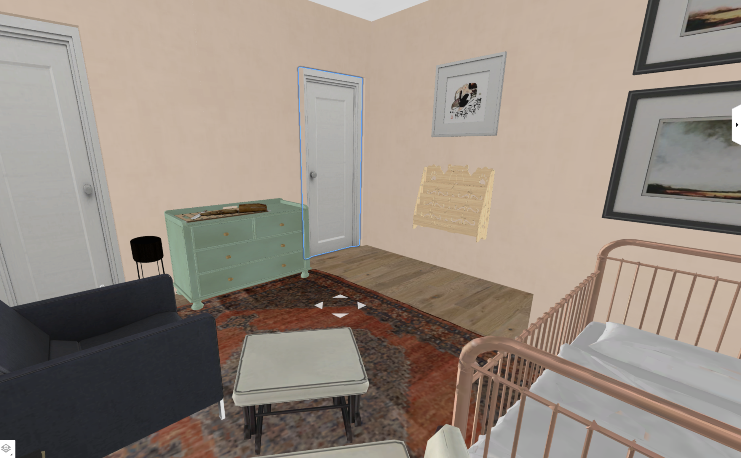
But my dreams of having a twin daybed were challenged with the layout. I could only see three feasible options as noted above (tap image to expand). None were ideal as the closet and closet door are small, the hallway is actively used so it can’t accommodate much furniture, the changing table is limited in storage, and it’s just a generally small room. Somehow these drawings make it feel really spacious, but in actuality, there’s less than 3’ of walking space between furnishings which isn’t very accessible.
Oh, and that bread cutting board shown in the renderings? That’s just the changing pad. My (free) software for room planning is great but it doesn’t have every single thing, so I improvised and I guess that was the best idea I came up with!
Anyway, what would you do in this situation? Go for the bed and make it a tight squeeze or prioritize only the necessities? Again, I’ve never tended to a miniature human, so I’m genuinely curious what folks who have raised babies would do in this situation.
While I’ve been fixated on the bed idea, I’ve hunted for a charming vintage day bed for months and couldn’t find one that was just right. So I shifted gears to searching for an antique pine sleigh bed like this one. This also took me ages! I hope this explains why I take so long to design a room - antique searching is time consuming and I feel like I always strike out. The only pine beds I could find were $2,000, yet my pal Natasha found this one for mere pennies by comparison. Blerg.
Ultimately I found this one which is perfectly cute, but not antique. It was $60 and local so it was an easy investment to see how the room could flow in real life (rather than in a computer simulation).
It turns out it a bed isn’t a great fit and I feel like I’ve been forcing the idea. I think the nook/alcove will be the perfect spot for a cute vintage twin bed one day, or a custom bunk bed situation, or a pull out bed. But I think we’ll need to have graduated from the glider and/or the crib to get to that stage. It’s a bit of a bummer because I wanted to make it work and I spent a billion hours sourcing antiques, but so it is! Designing thoughtfully takes a long time!
So this is the design we’re toying with now. If we tuck the crib in the alcove, it opens up the room more than having it on the opposite wall (cribs are deeper than dressers). We’re also able to get a bigger dresser for more surface on top for gear and more storage underneath for clothes. We have a glider, a few spots for toys/baskets/side tables/plants/etc. And we’re thinking of putting an extra chair in there so the three of us can hang out together. Instead of the chair, I’m tempted to source an antique bench and fill it with pillows, but for now I’ll use a chair we already have in the living room. Then, in a new phase of babyhood, we’ll add a toy chest, or a bench, or a play set, or whatever babe needs.
Alrighty, so you’re like, “I get it. You’re putting furniture in a room. Show us some of the design - the finishes, the colors, the feel!” Okay okay, jeeze!
Here’s my nursery inspiration:
Click through the individual photos to admire them in a larger size. Or click here to see them all bigger.
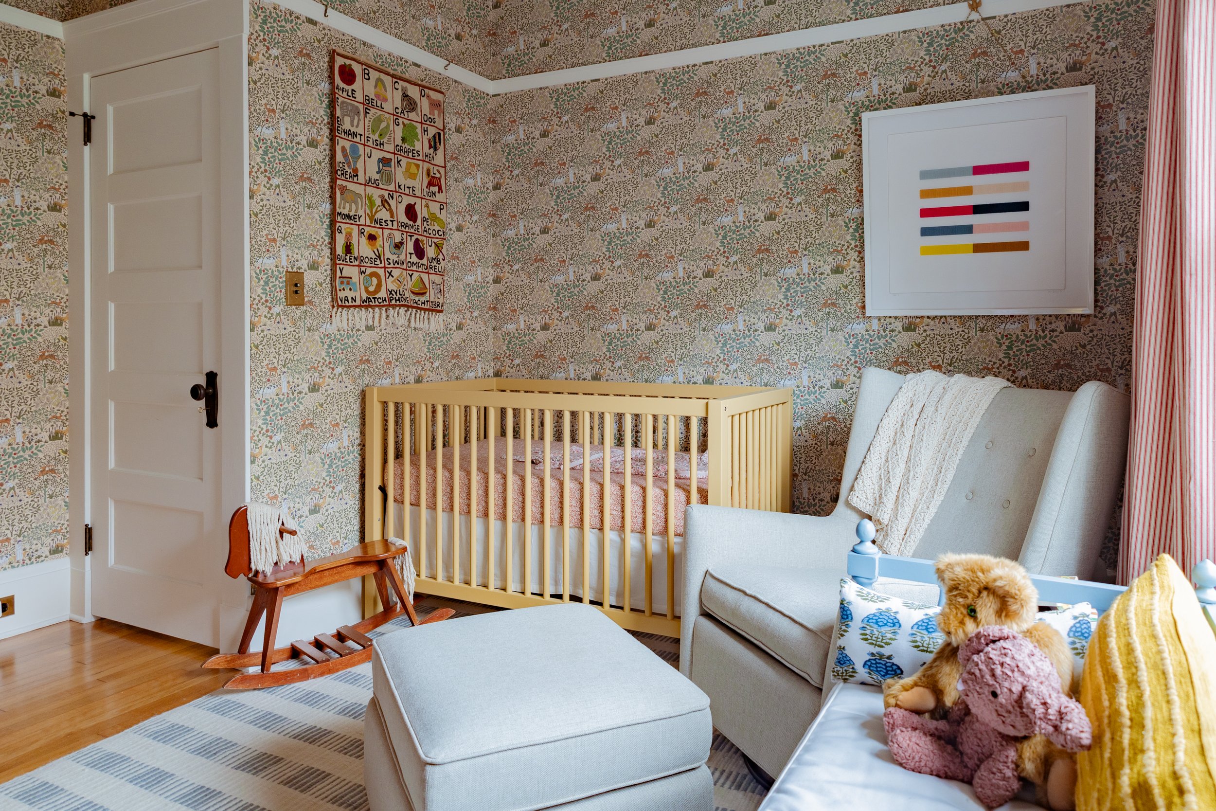
I want something layered, textural, colorful, quirky, and historic with antiques, wallpaper, fun hues, and playful elements. I’ve been inspired by designers Meta Coleman and Beata Heuman who both play with color in such a great way. So running with their mix of hues, I’ve been considering red trim, a yellow crib, a blue plaid chair, a green dresser, patterned curtains, and so much more. I got a bunch of wallpaper samples and played with colors, and then I discovered my vision was already brought to life (but 100 times better) by Lonika Chonda.
How funky and eclectic is that room (and the whole house)?? It’s way out of my comfort zone, but that’s what I love about it. I keep gravitating towards color but keep finding myself painting things neutrals. Where better to get playful with color than a kids room, right?? I gotta push myself somewhere!
Lonika used the Alice in Wonderland paper for that sweet nursery, and I was conveniently eyeing papers by the same designer, Charles Voysey who was a prominent designer in the Arts & Crafts movement (perfect for my historic home). The two above are the ones I narrowed my selection down to. On the left is The House that Jack Built which was designed by Voysey in 1929 as a nursery fabric. On the right is The Shepherd which was designed by Voysey and produced as a rug in 1930.
Which one did I pick? Well, it’s being installed next week, so tune in for the grand reveal soon!
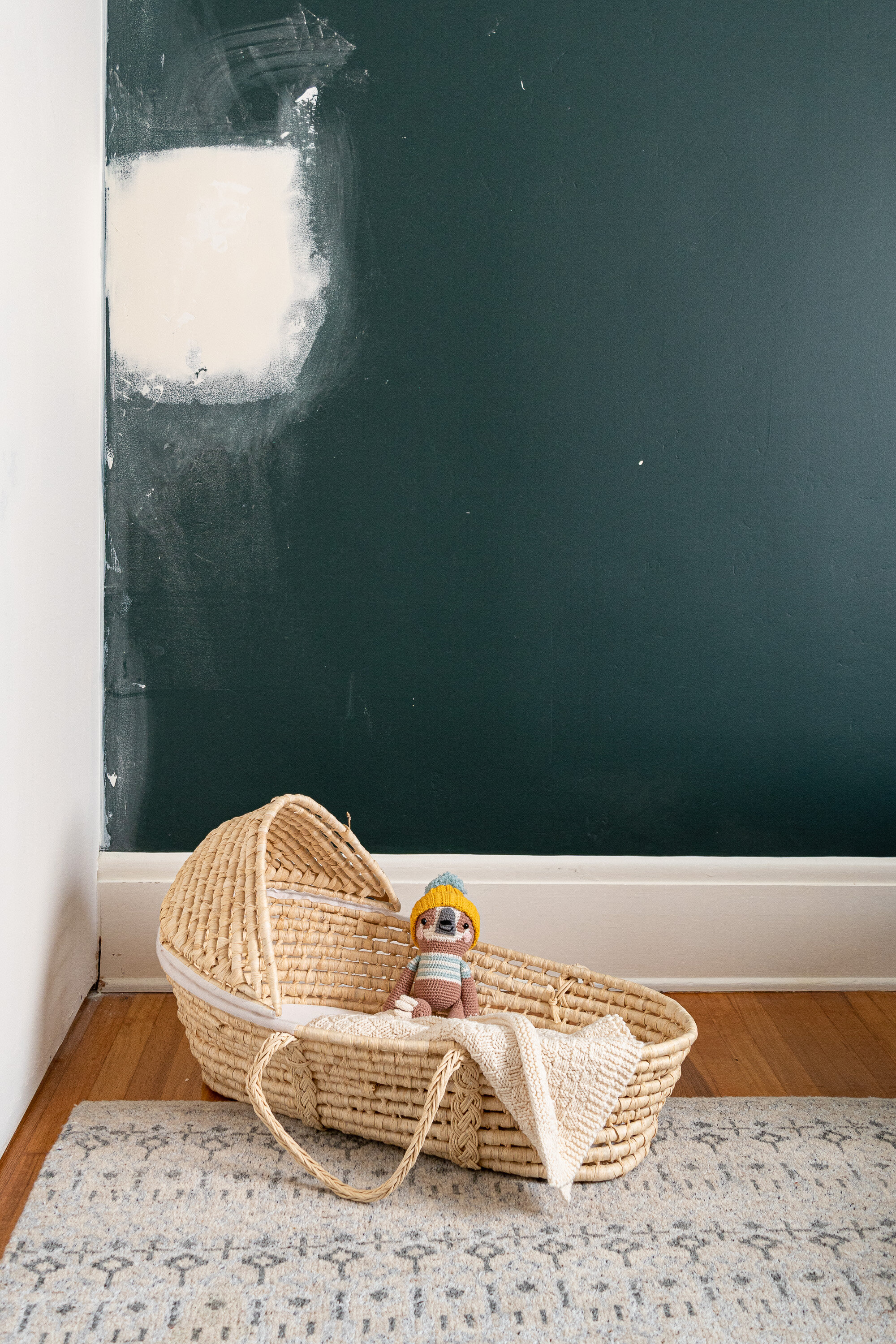
I have to point out the cute knitted sloth! It was handmade for baby by Cathy’s mom. Yep, the Cathy you all know as The Grit and Polish. Thanks, Nana! The blanket was handmade by my aunt, too!
For other sources, the moses basket was a FB Marketplace find, the rug is leftover from the den and is vintage, and the walls that are soon to be covered in paper are painted in Benjamin Moore’s Salamander. And a reminder the free software I use for laying out floor plans is explained here.
Feel free to weigh in on the layout and design :)

